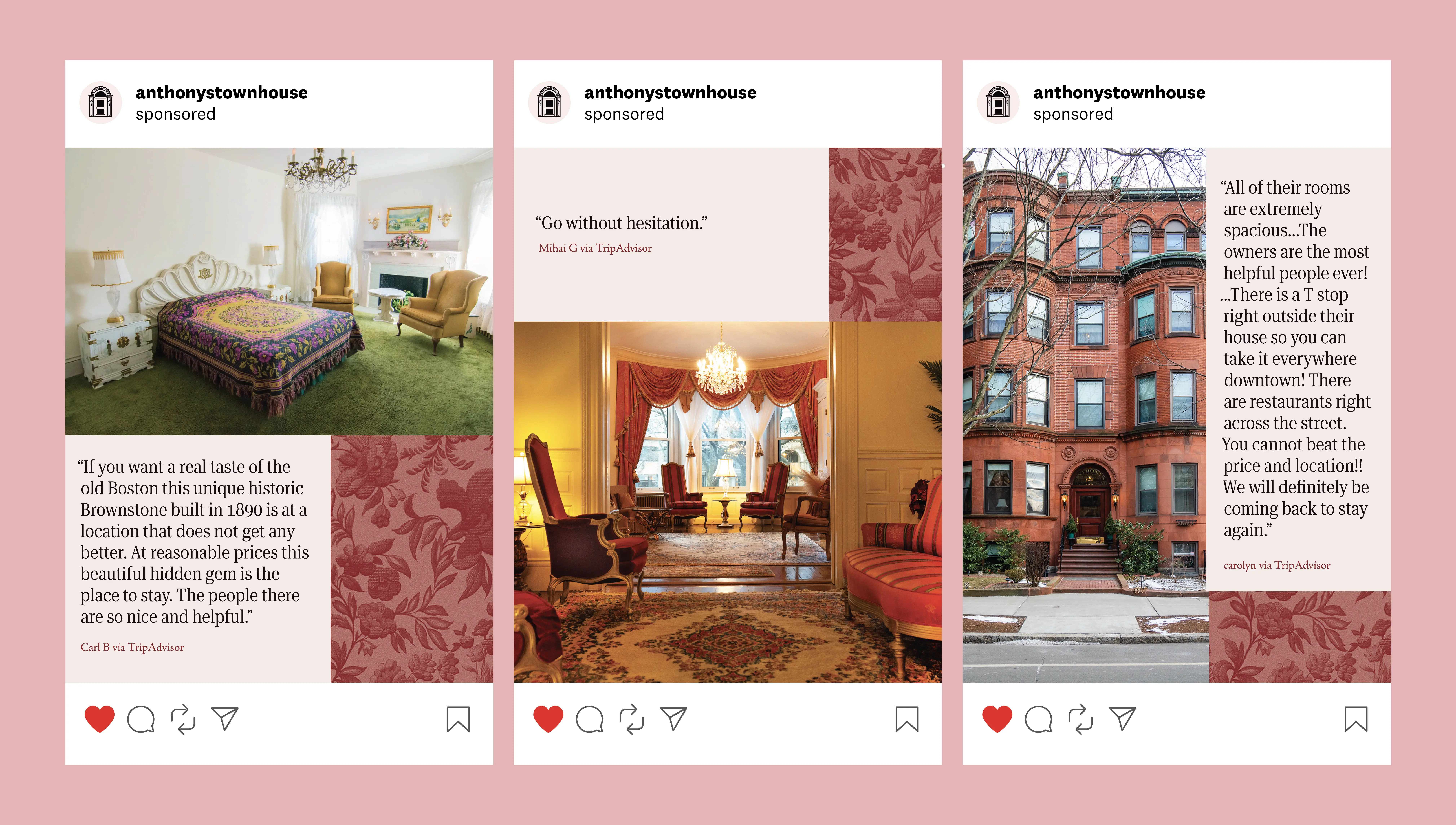
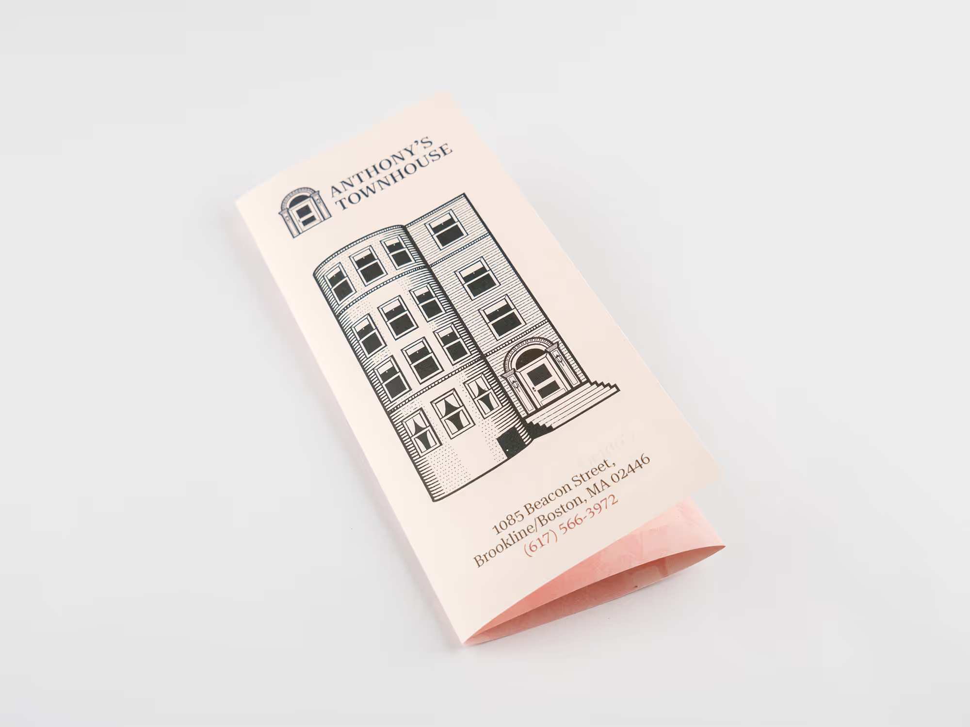
I worked with Barbara Anthony to refresh the identity of her 75 year old Brookline inn: Anthony's Townhouse. I used distinct elements from the property along with inspiration from its history to create a new visual identity.
^
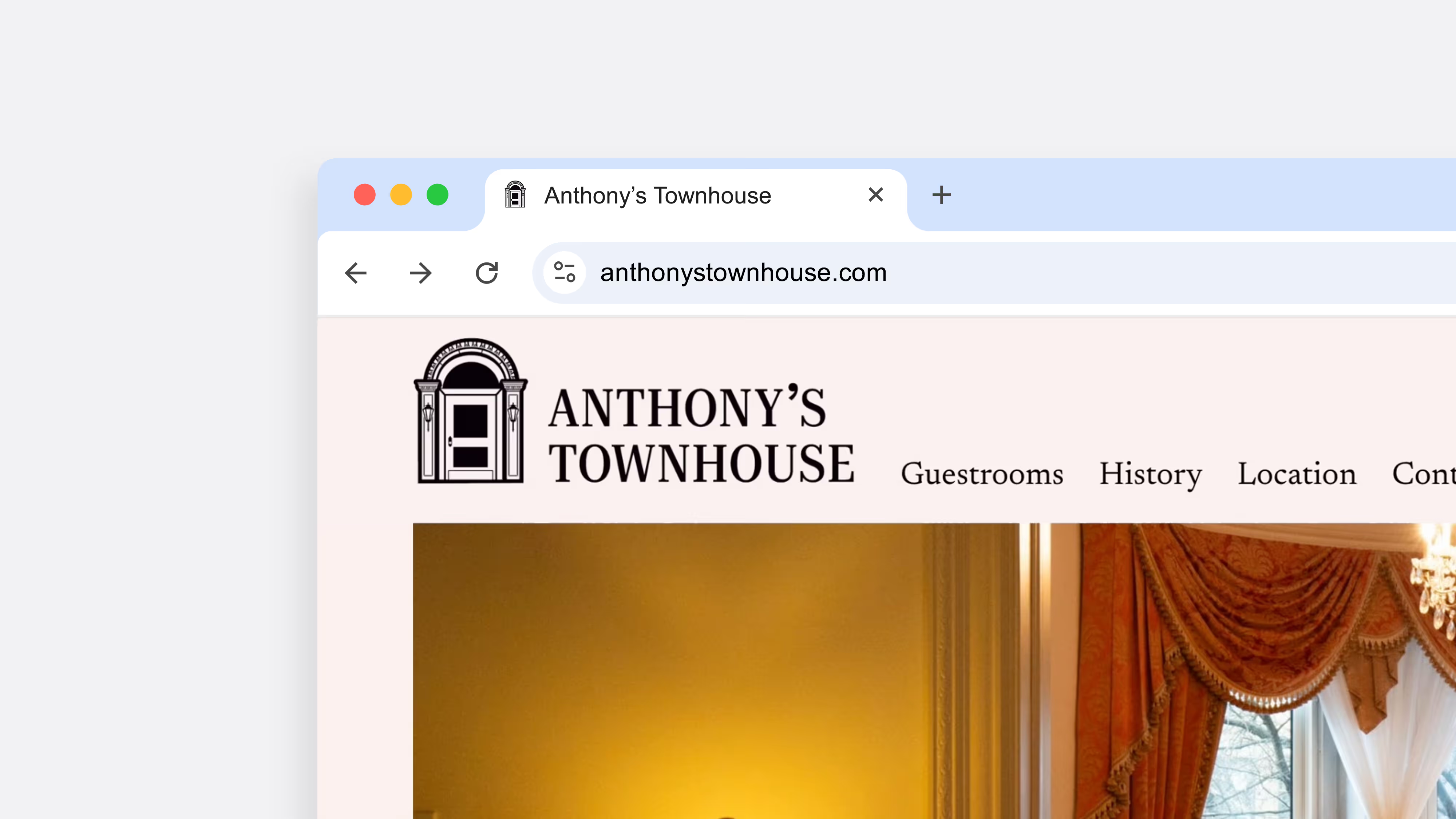
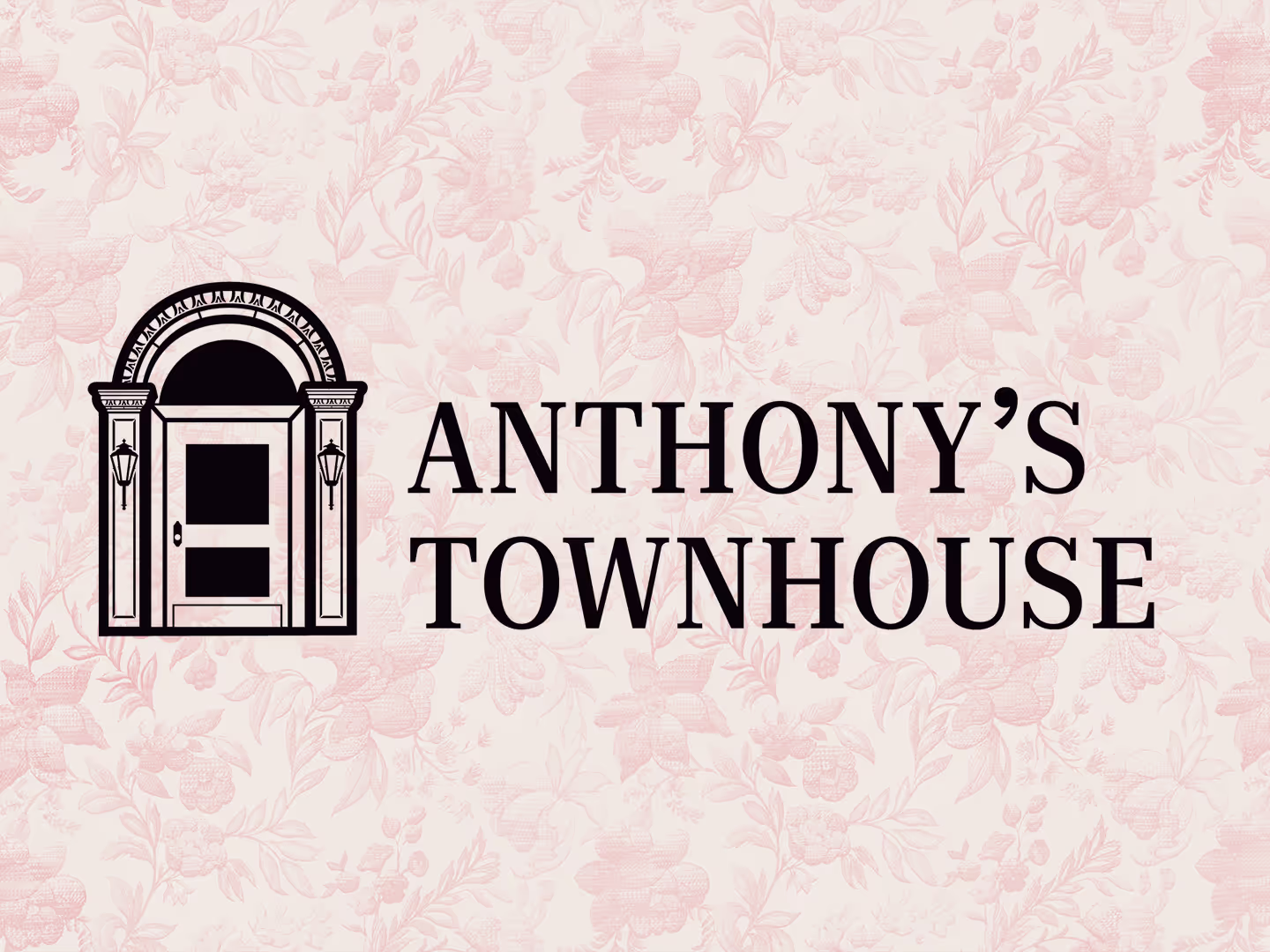
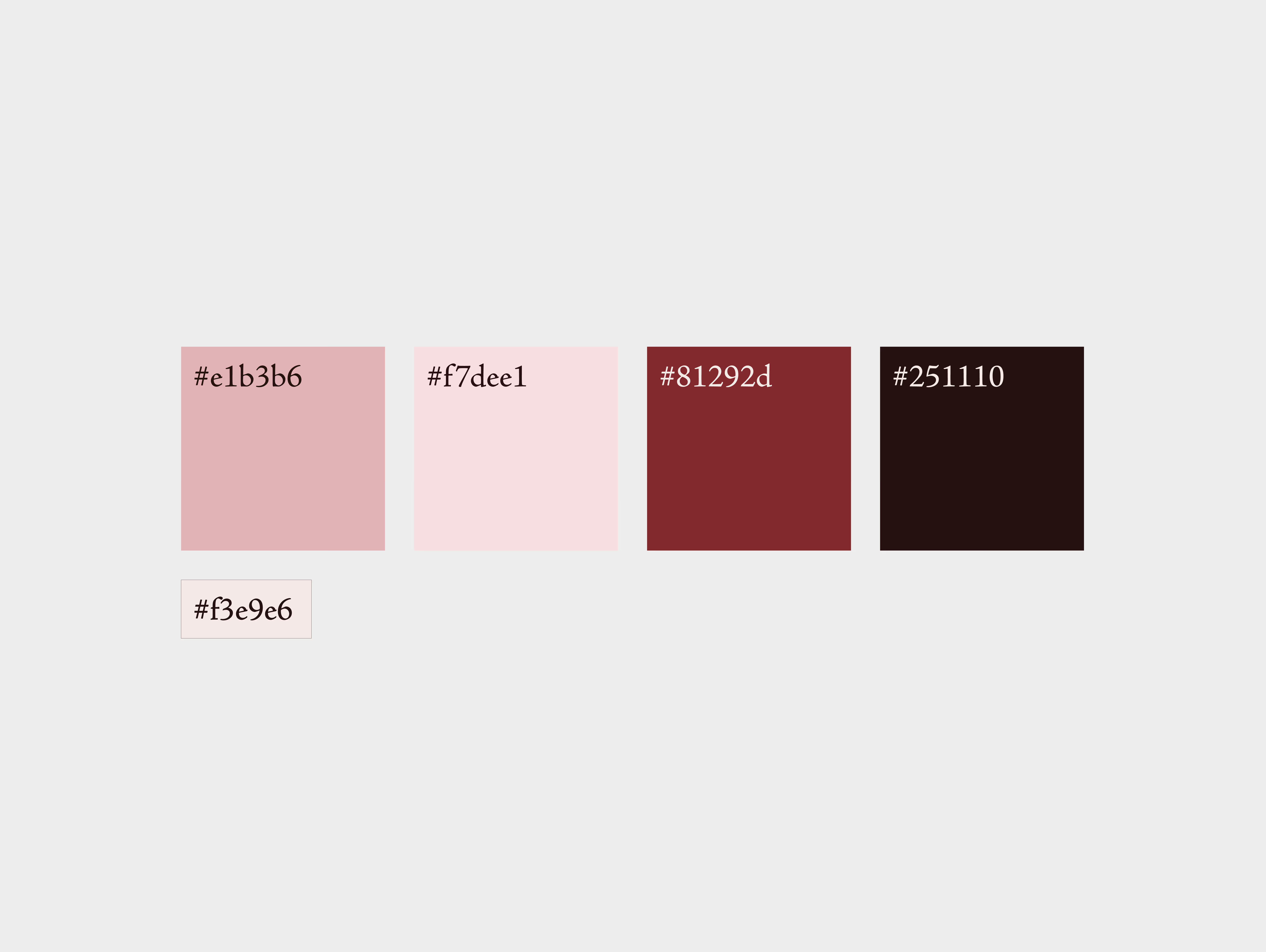
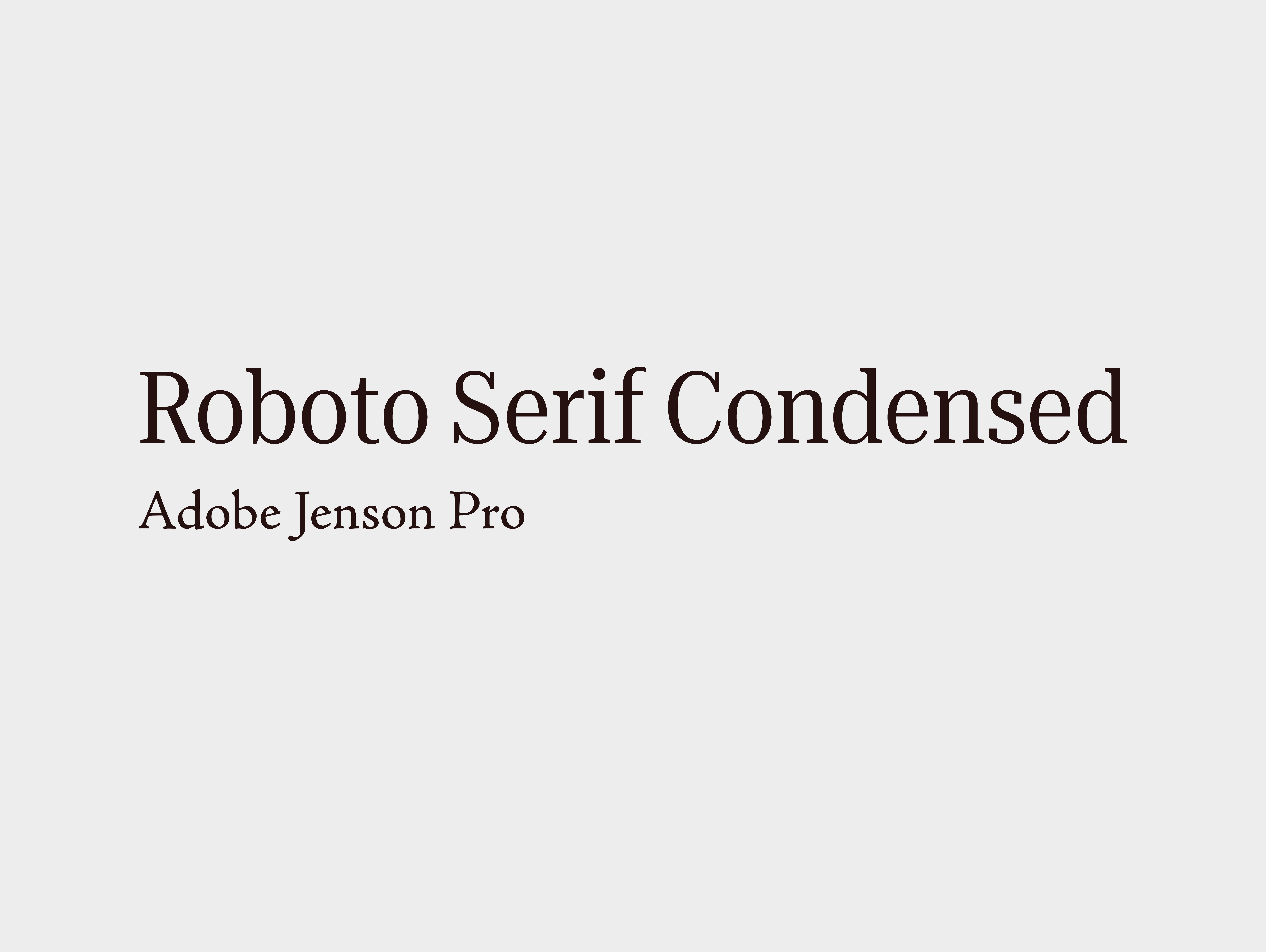
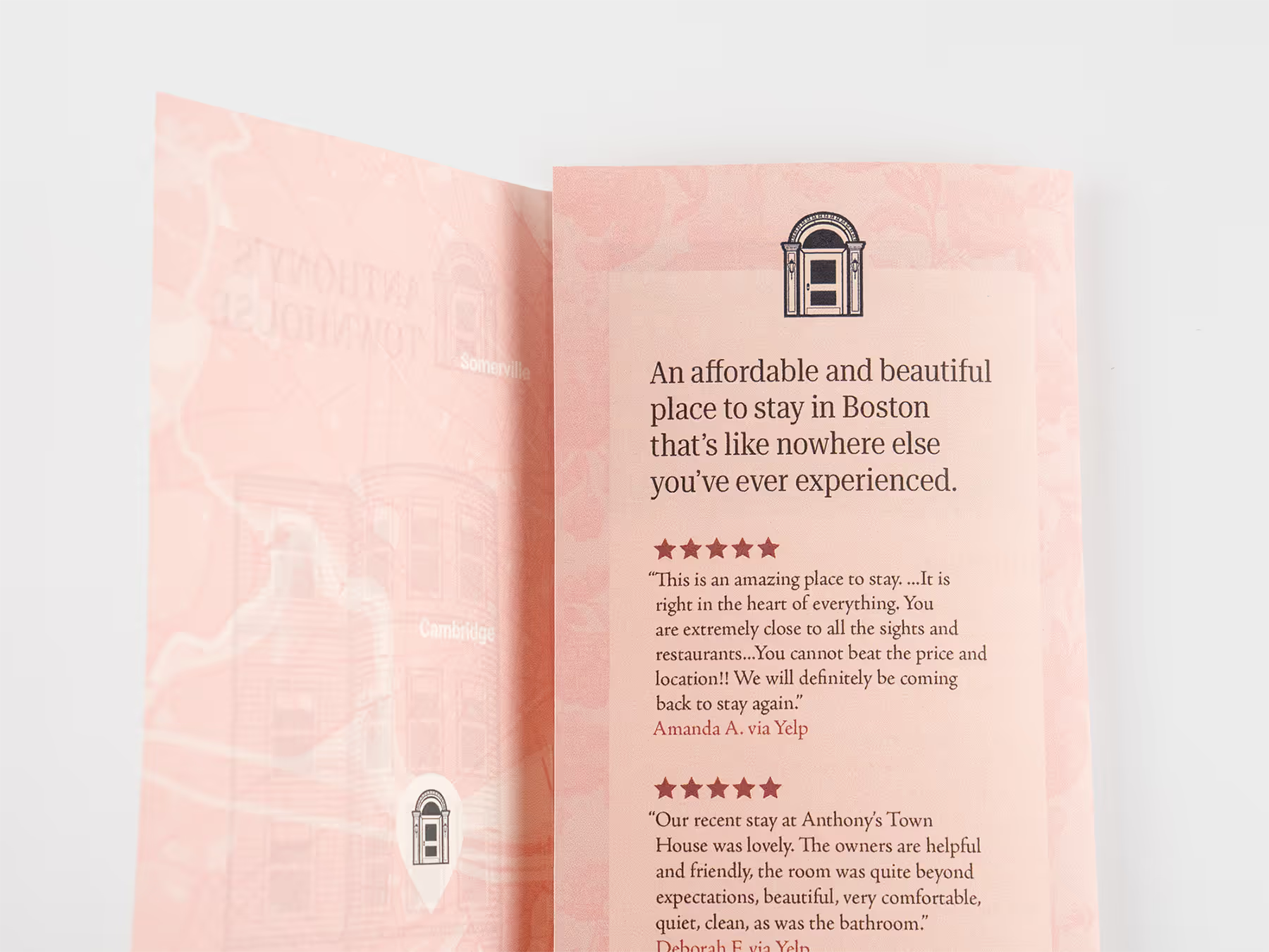
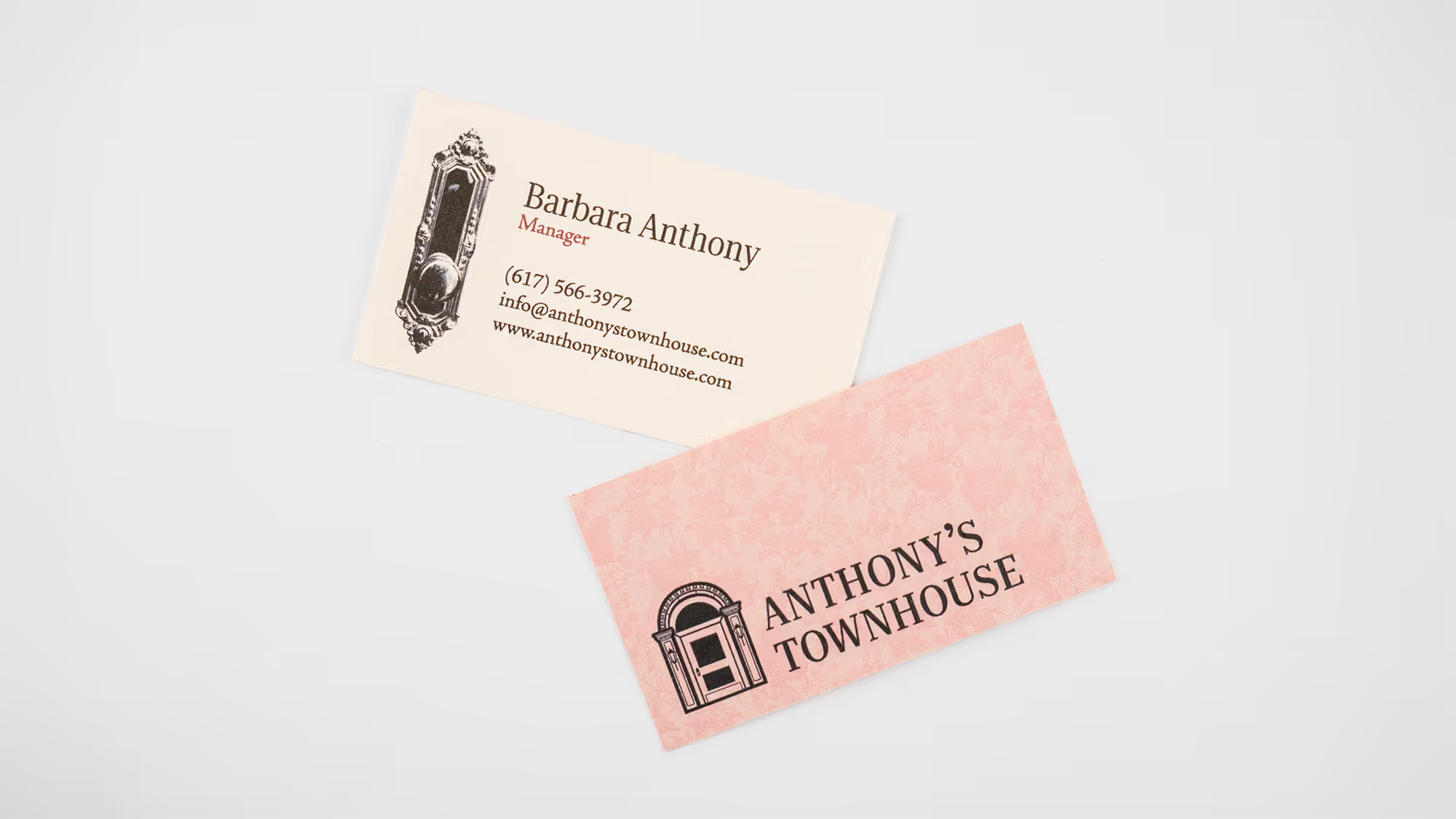
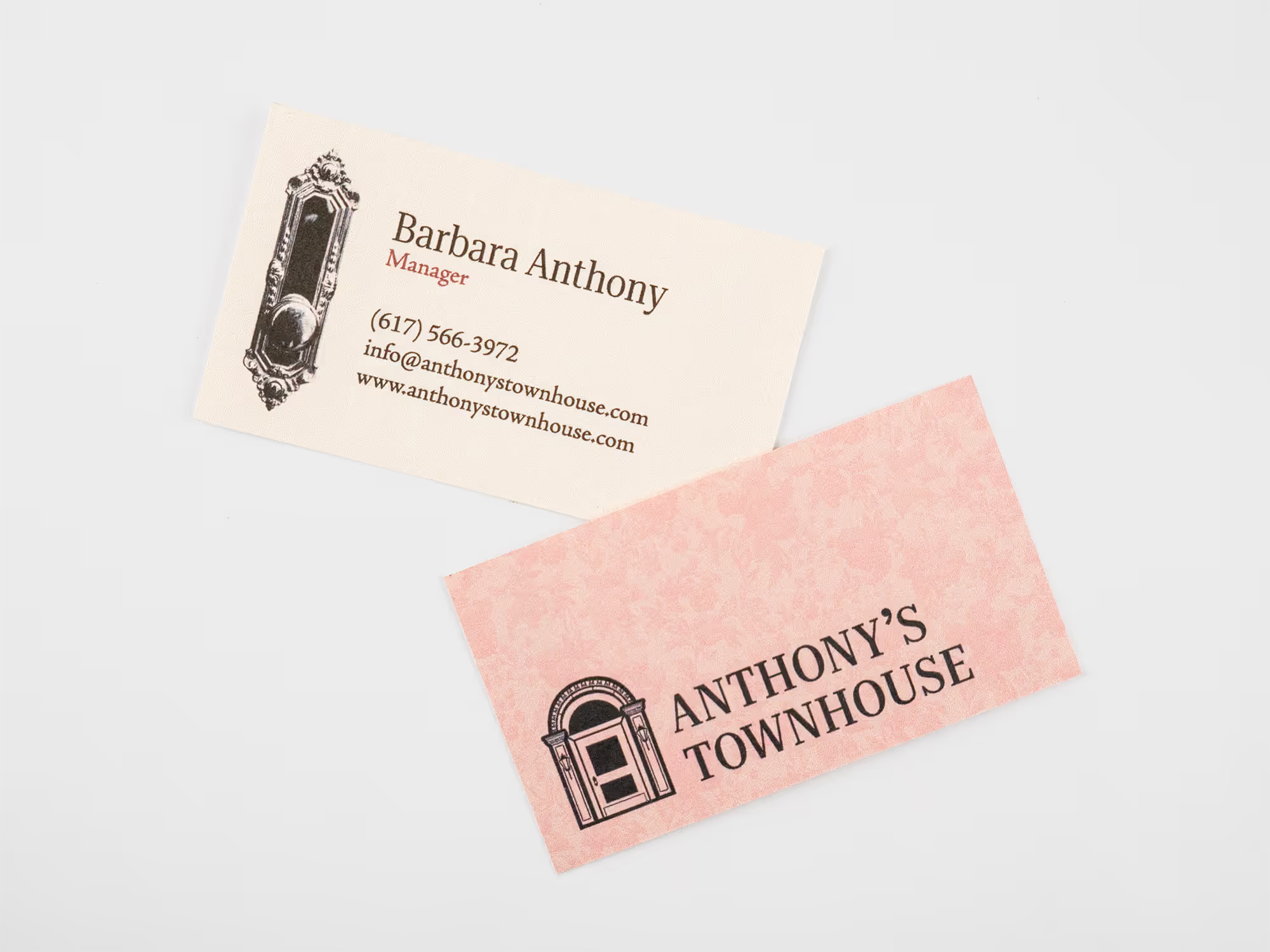
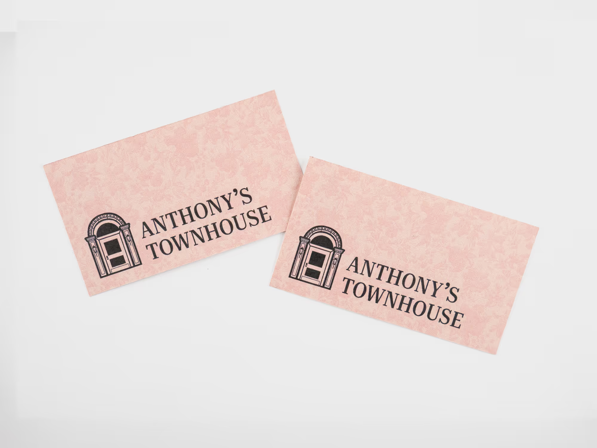
The door icon is a simplified version of the townhouse. I chose the door because it embodies both the ornamental beauty of the property and the welcoming nature of those who run it. The floral pattern is a recreation of the wallpaper in their kitchen. The color palette leans entirely warm to reflect the personality of the hosts and the space they curate. Additionally, I chose these fonts to evoke a Colonial era feel as well as compliment the logo.
^
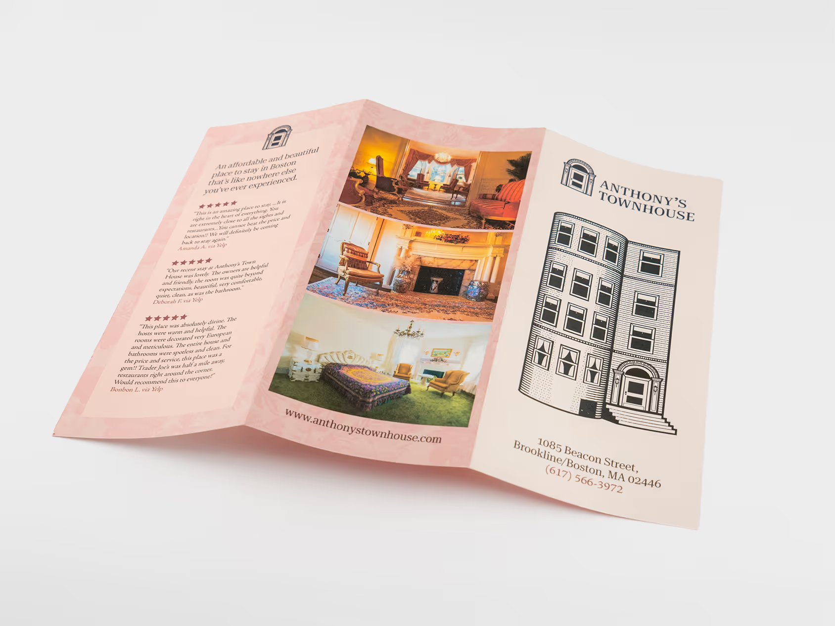
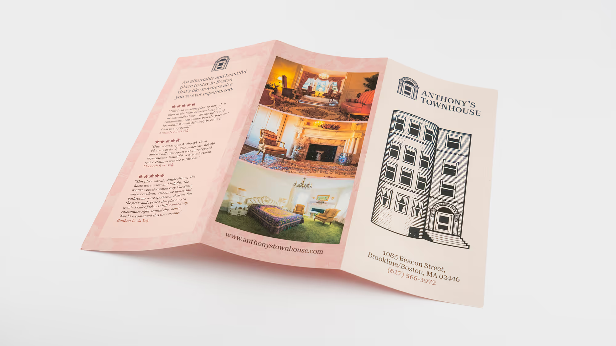
The brochure is designed with shelves in mind. The logo and name are large at the top to be visible even if there are more brochures stacked in front of it. The photos on the back immediately display the unique and ornamental style of the townhouse.
Website Before
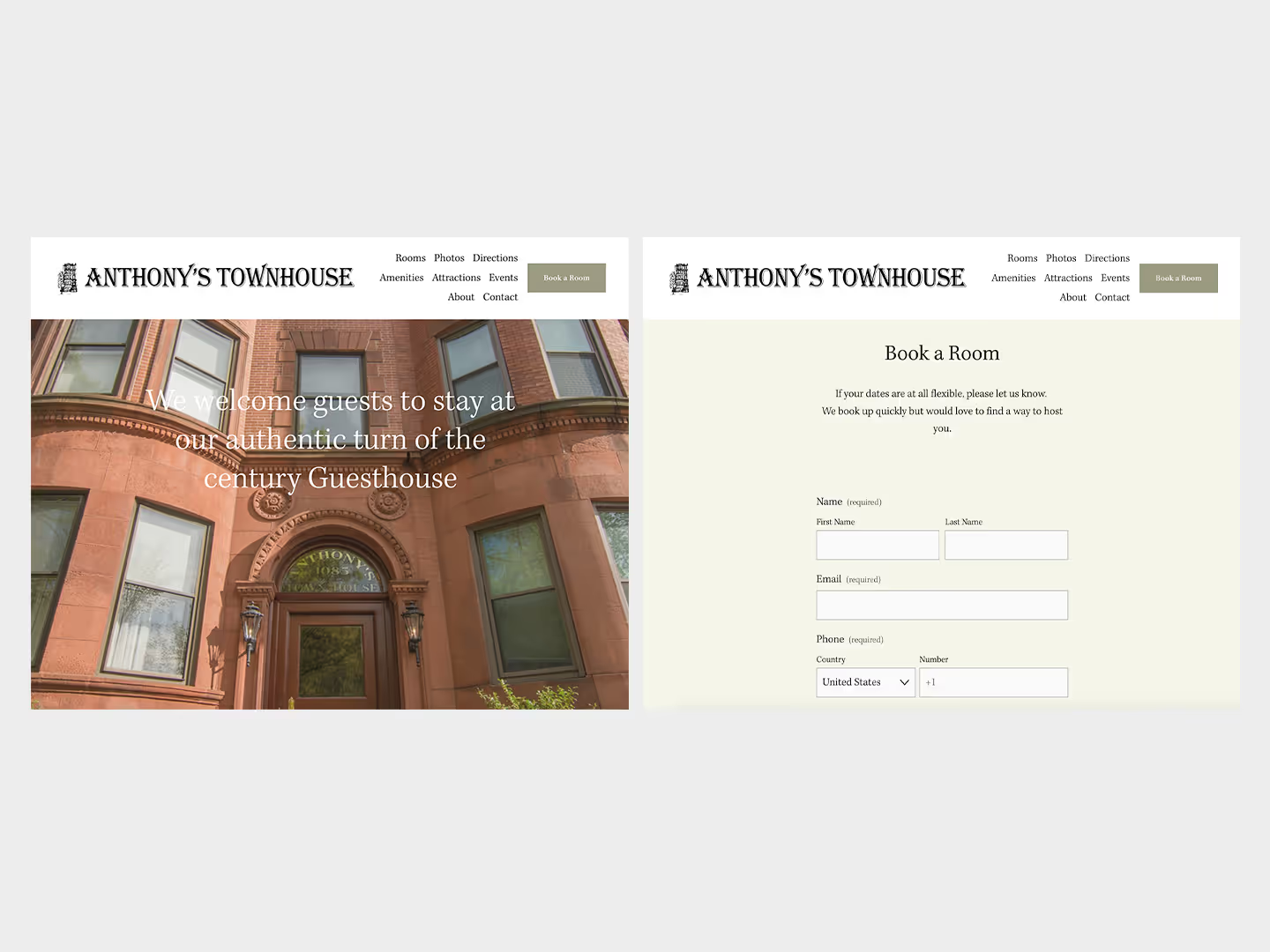
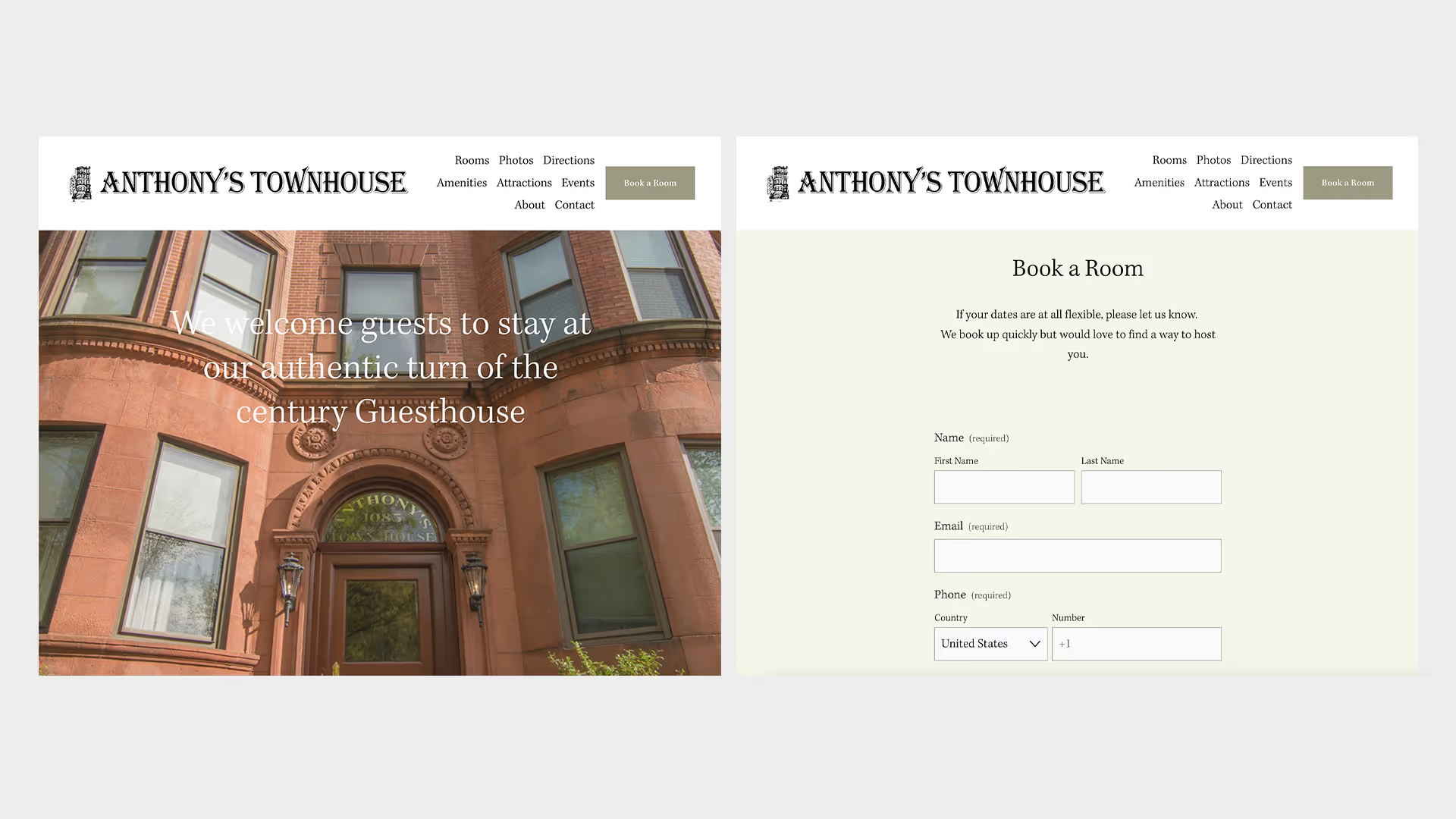
Website After
.webp)
