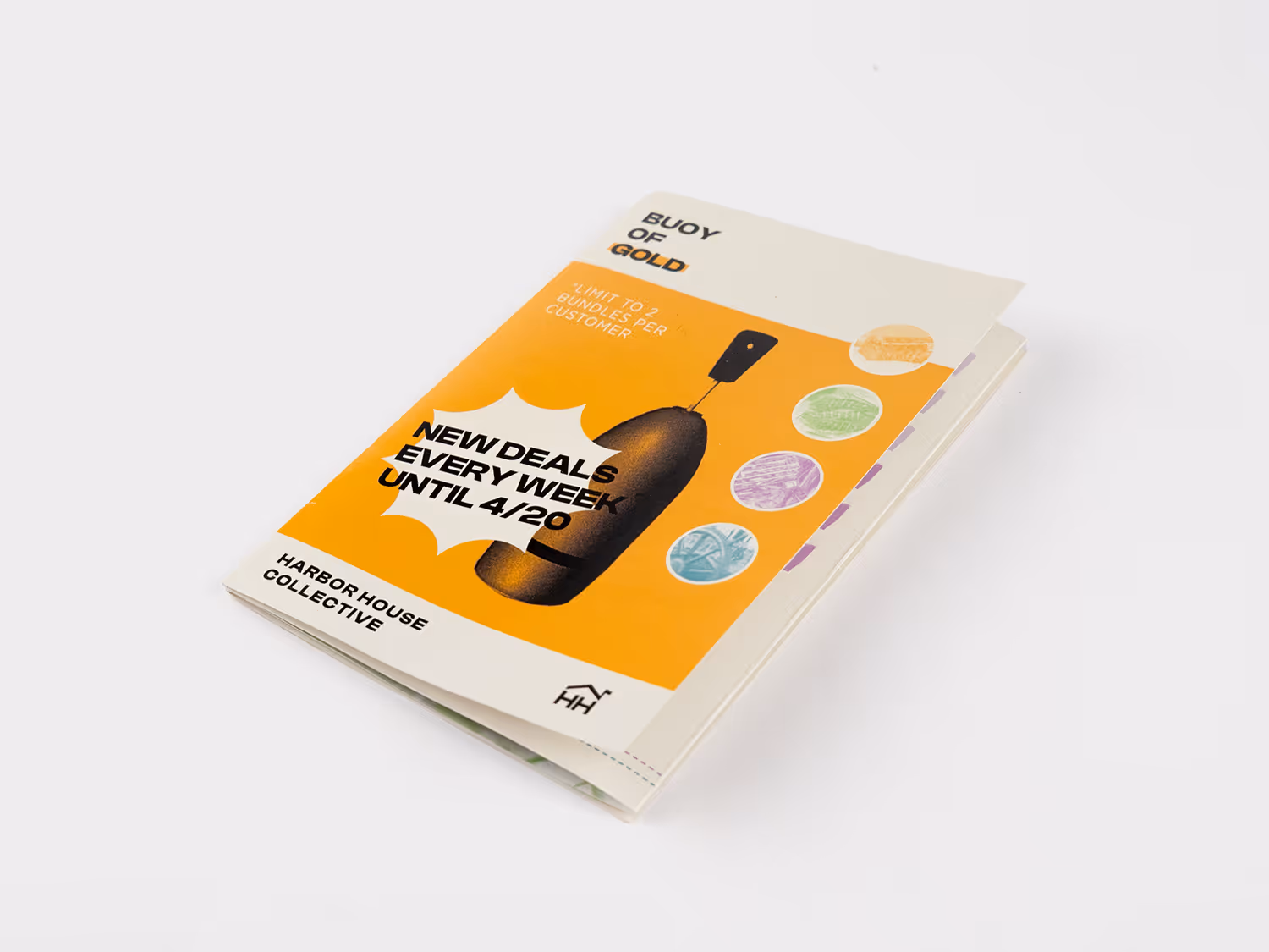
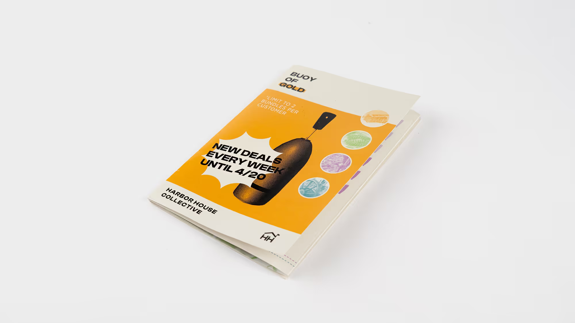
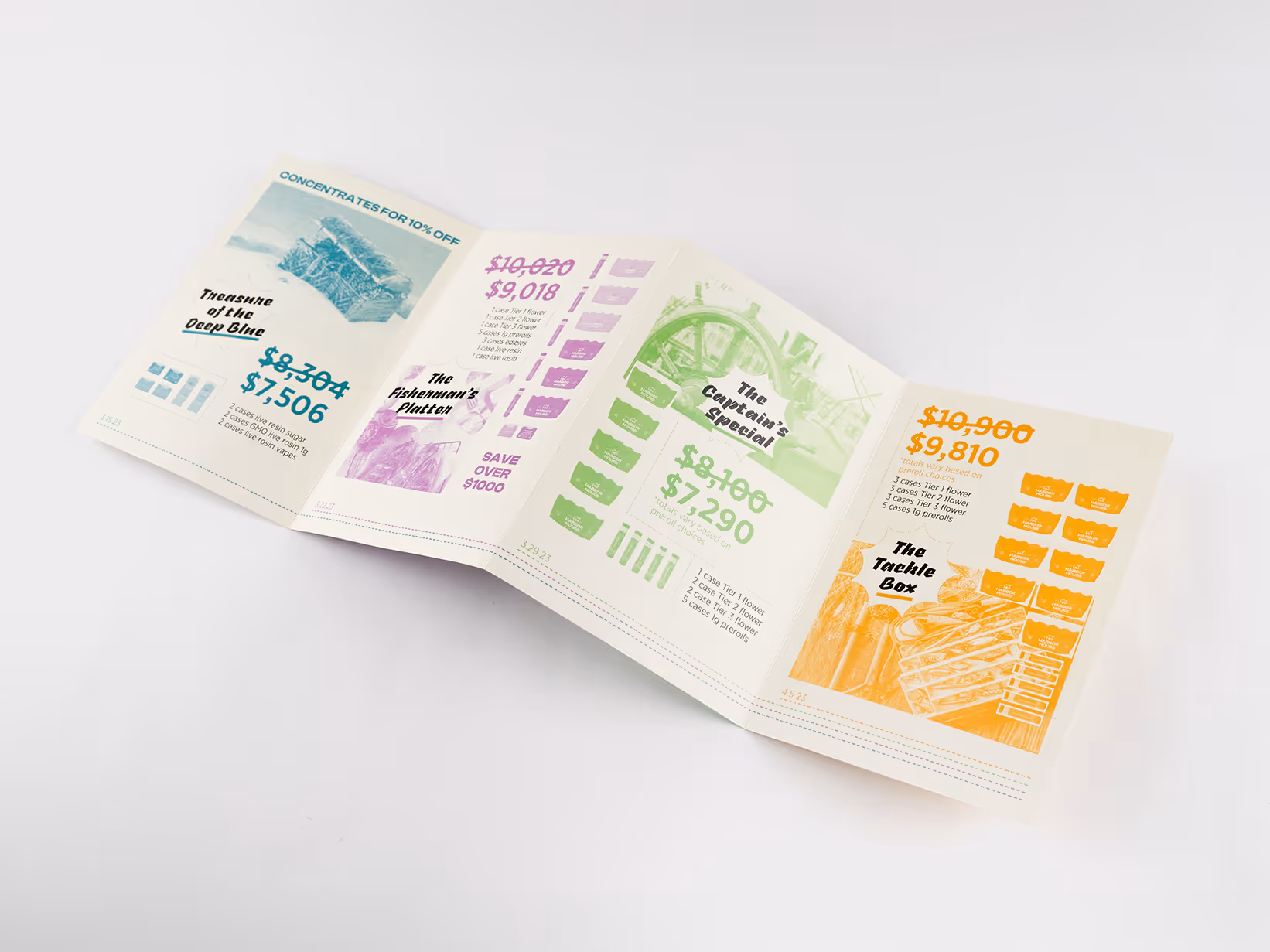
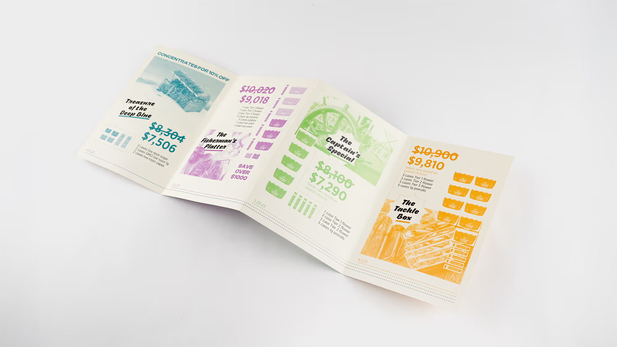
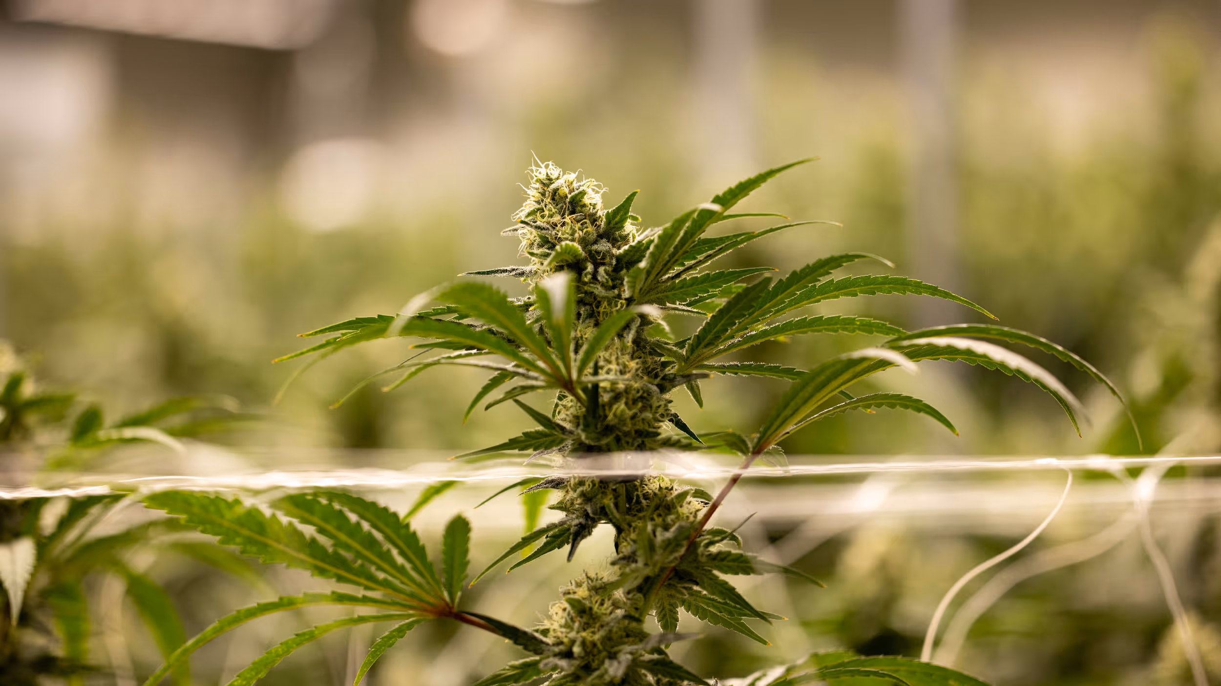
HHC is a dispensary and marijuana production company that distributes product across all of Massachusetts. While there, I worked as the sole designer creating work for every department including production, marketing (both wholesale and retail), and management. I also redesigned most of their packaging.
^
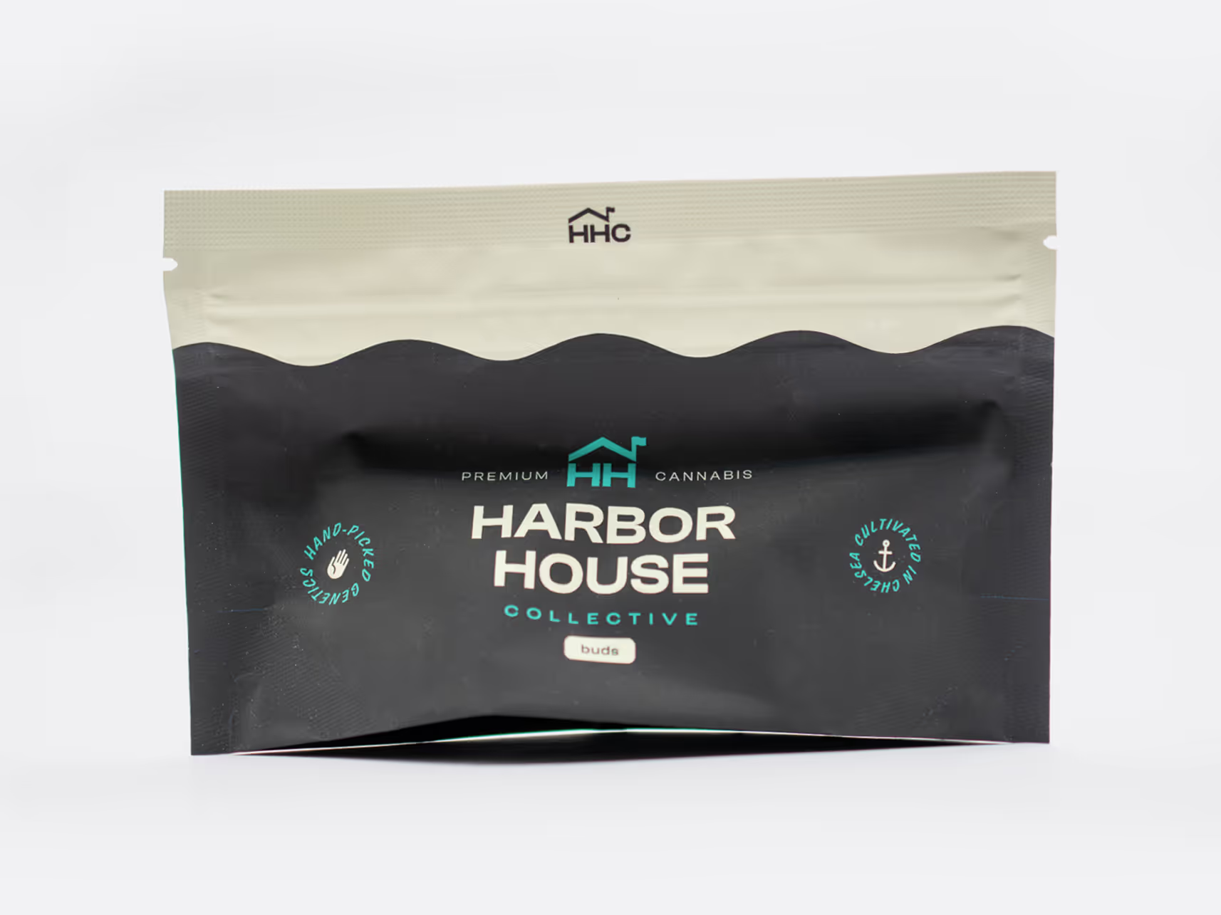
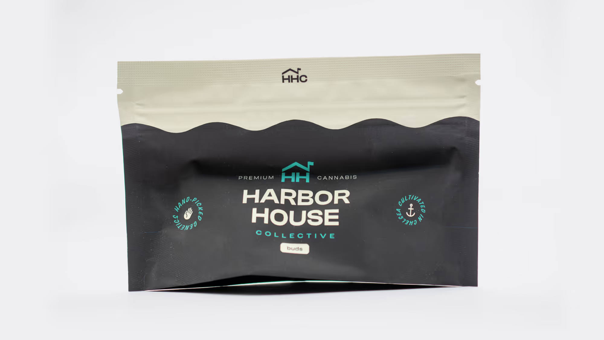
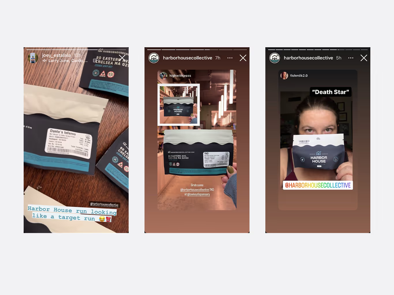
When my redesign of the flower package released, customers noticed and posted stories of the new layout.
^
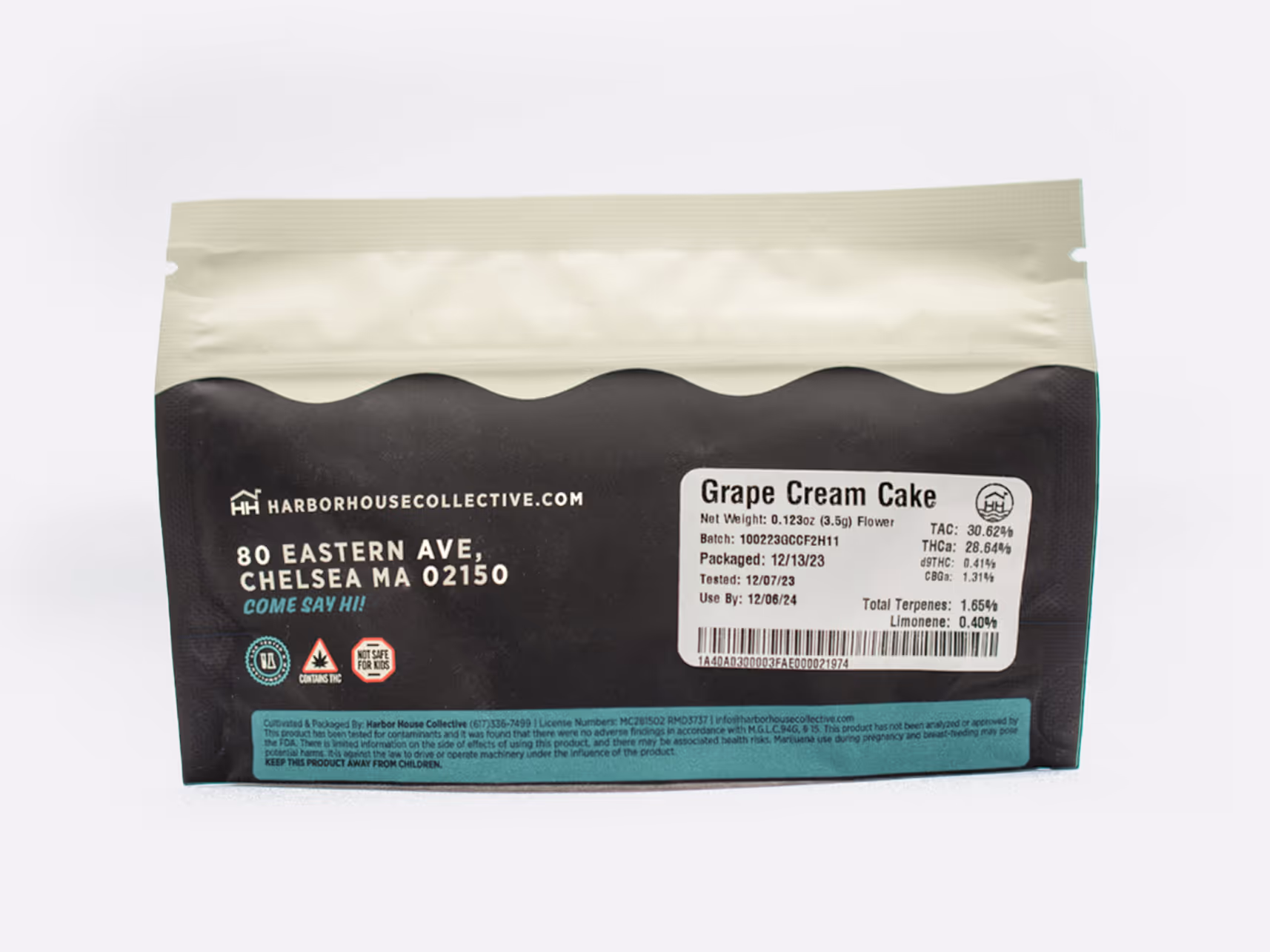
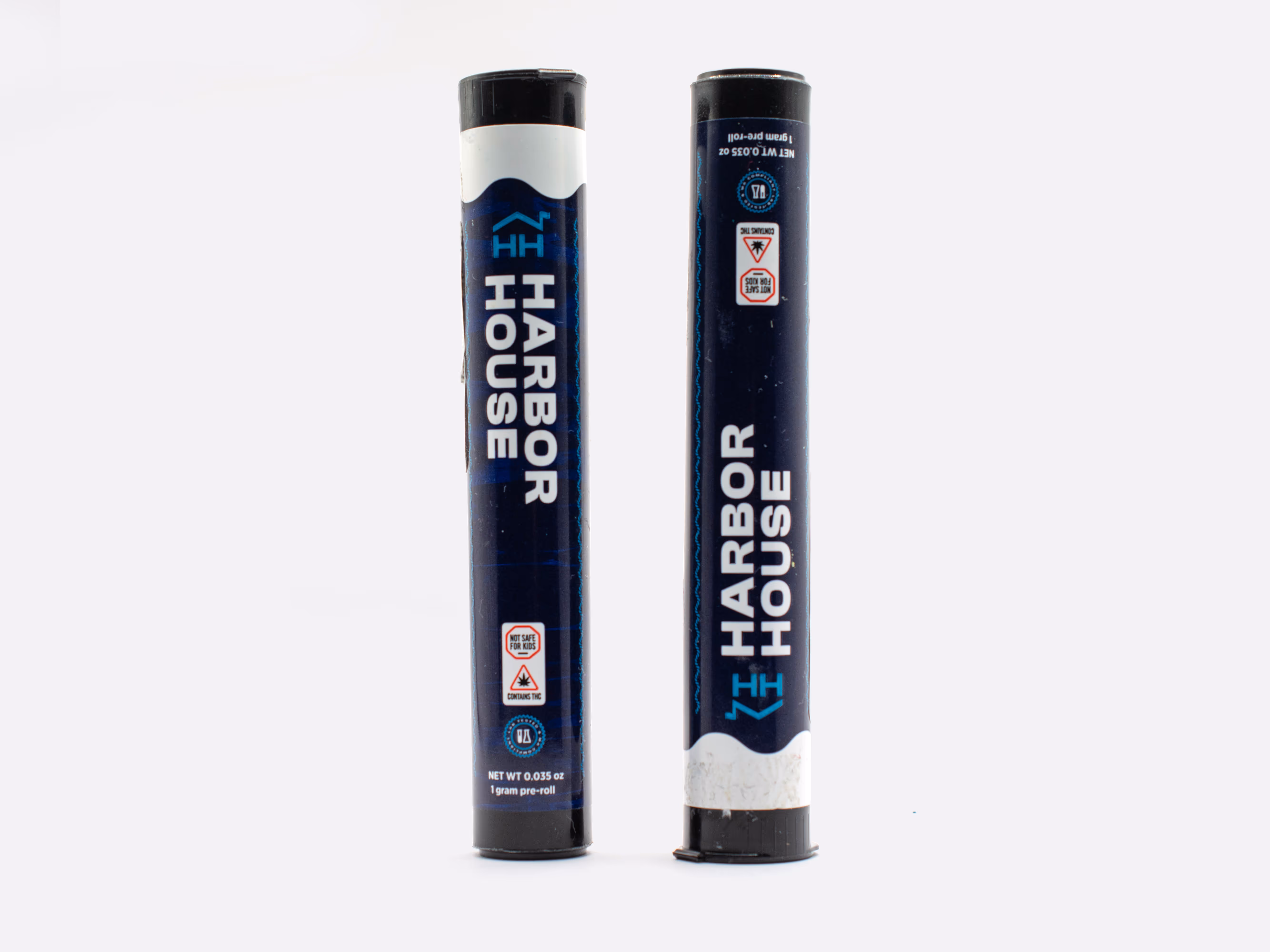
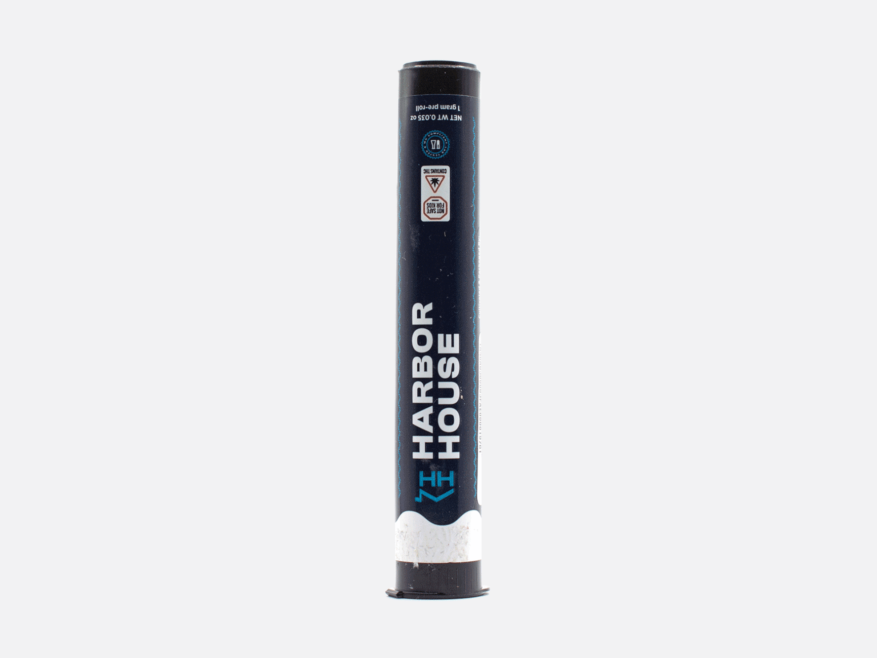
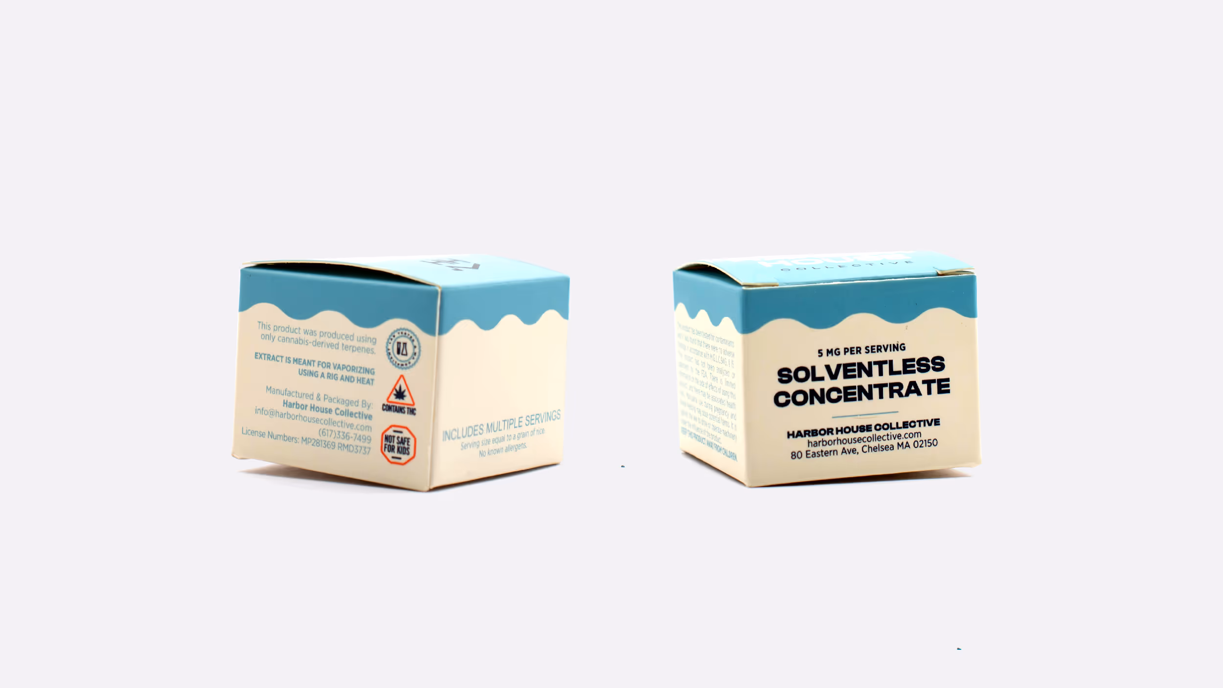
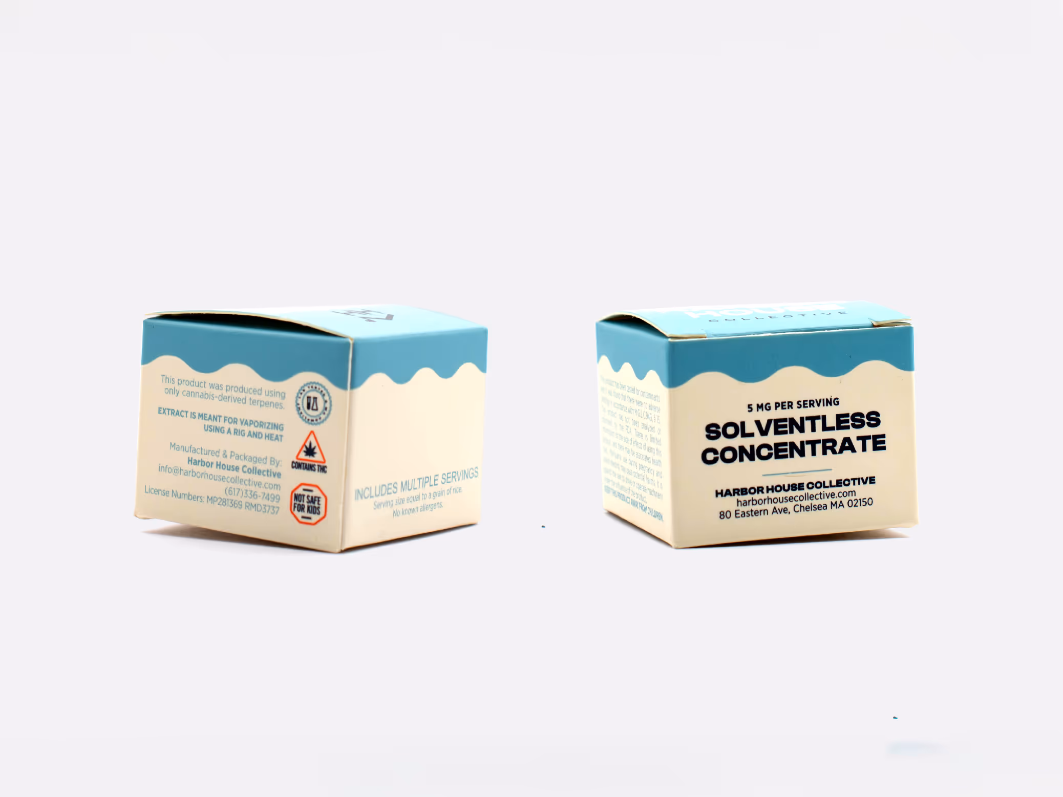
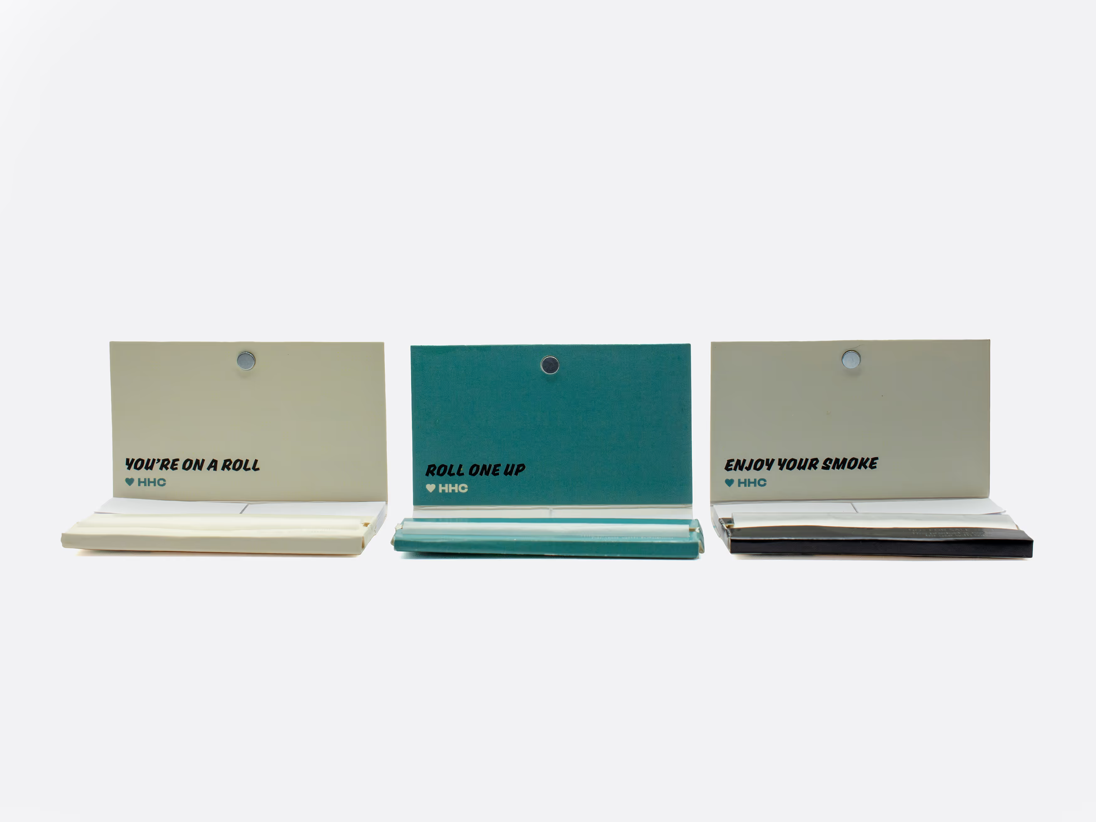
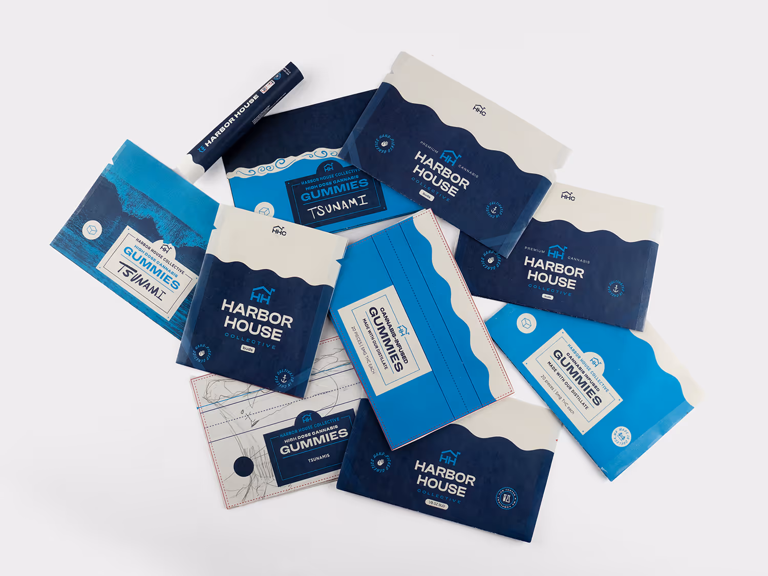
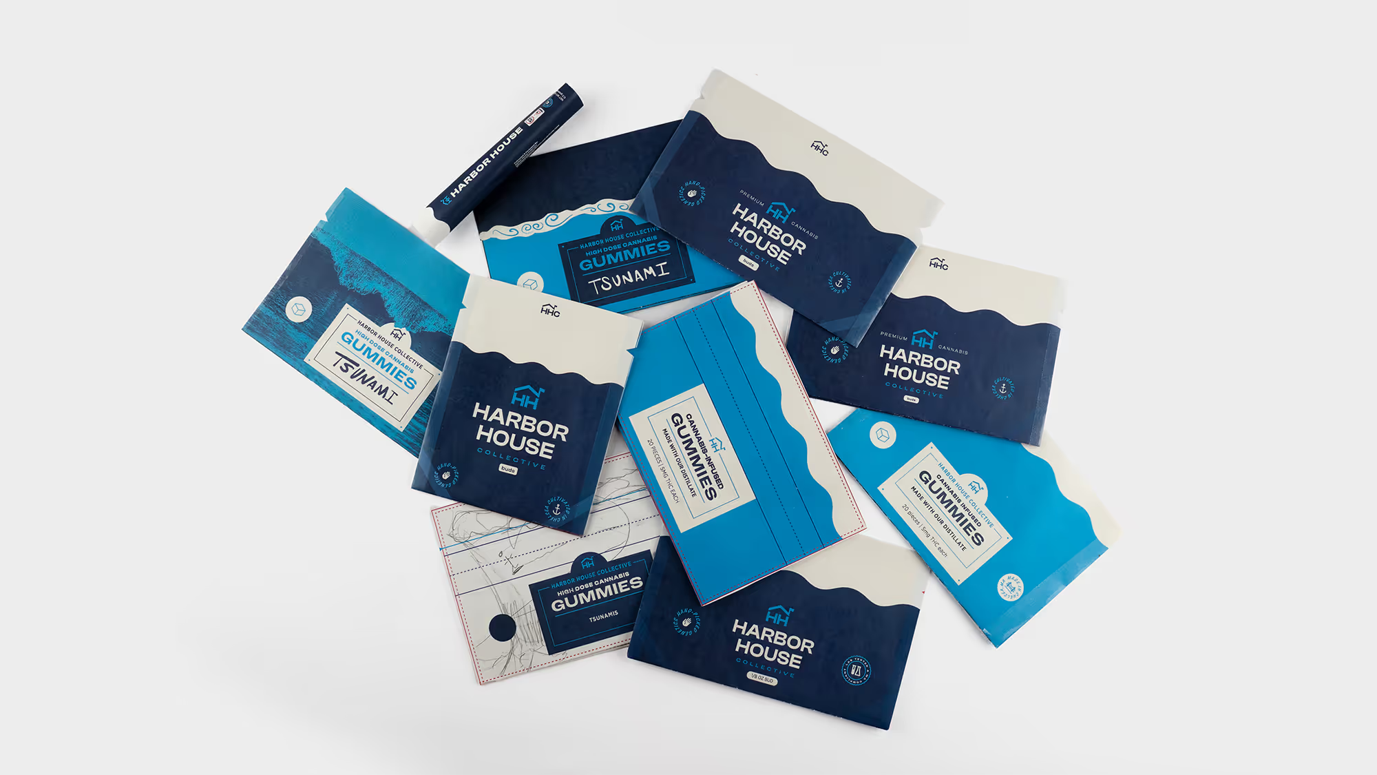
The redesign of the solventless concentrate box was made to be visually distinct from the solvent concentrate box (which has a dark blue wave instead of a light blue wave). This allows the packaging team to easily differentiate between the products from above when arranged on a tray. On the preroll packaging and flower bags, I added placement guides for the legally required identification labels.
^
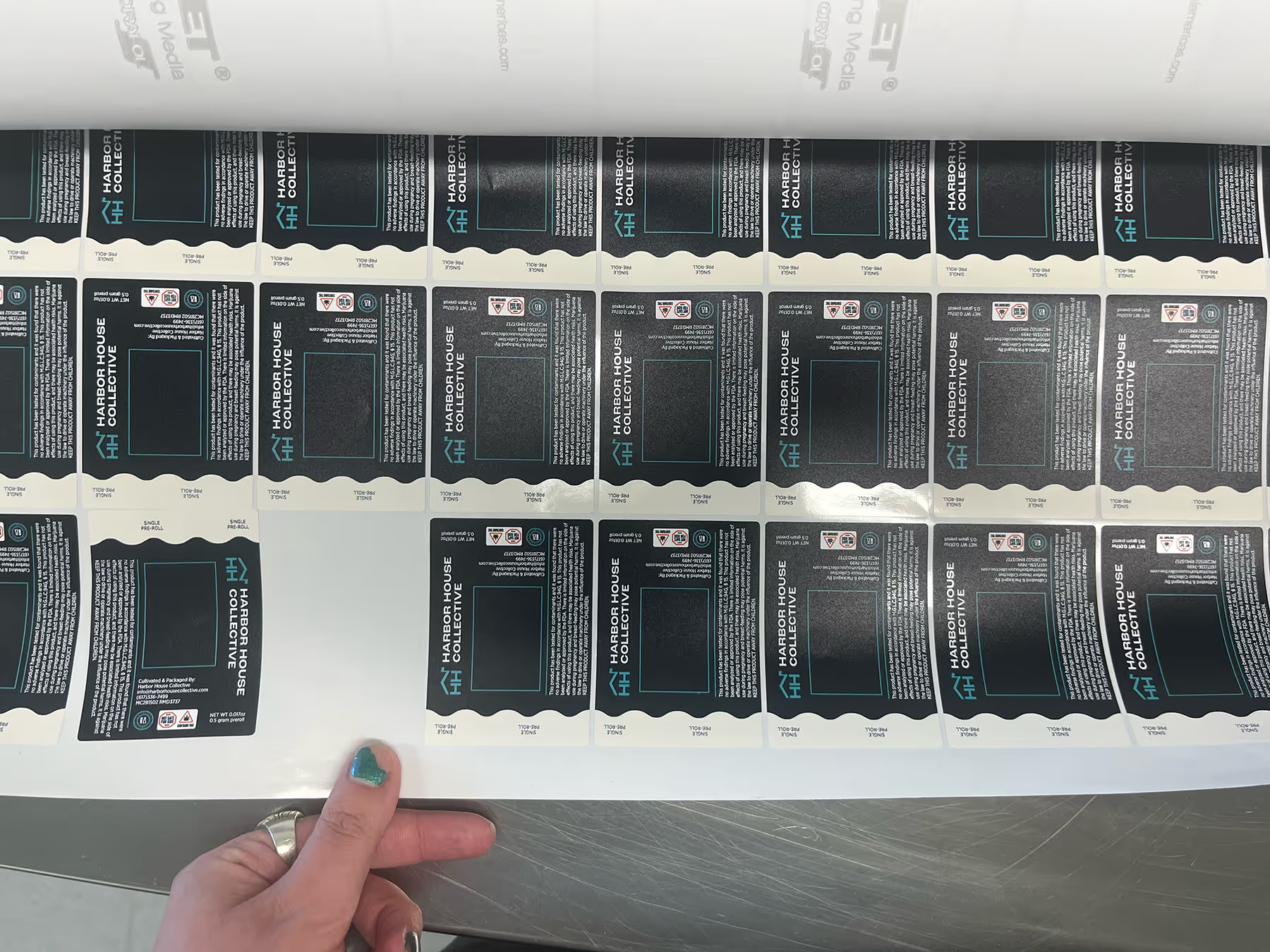
For each packaging redesign, I followed the same process of printing the dieline on the office printer, folding to form, refining the design and repeating.
^
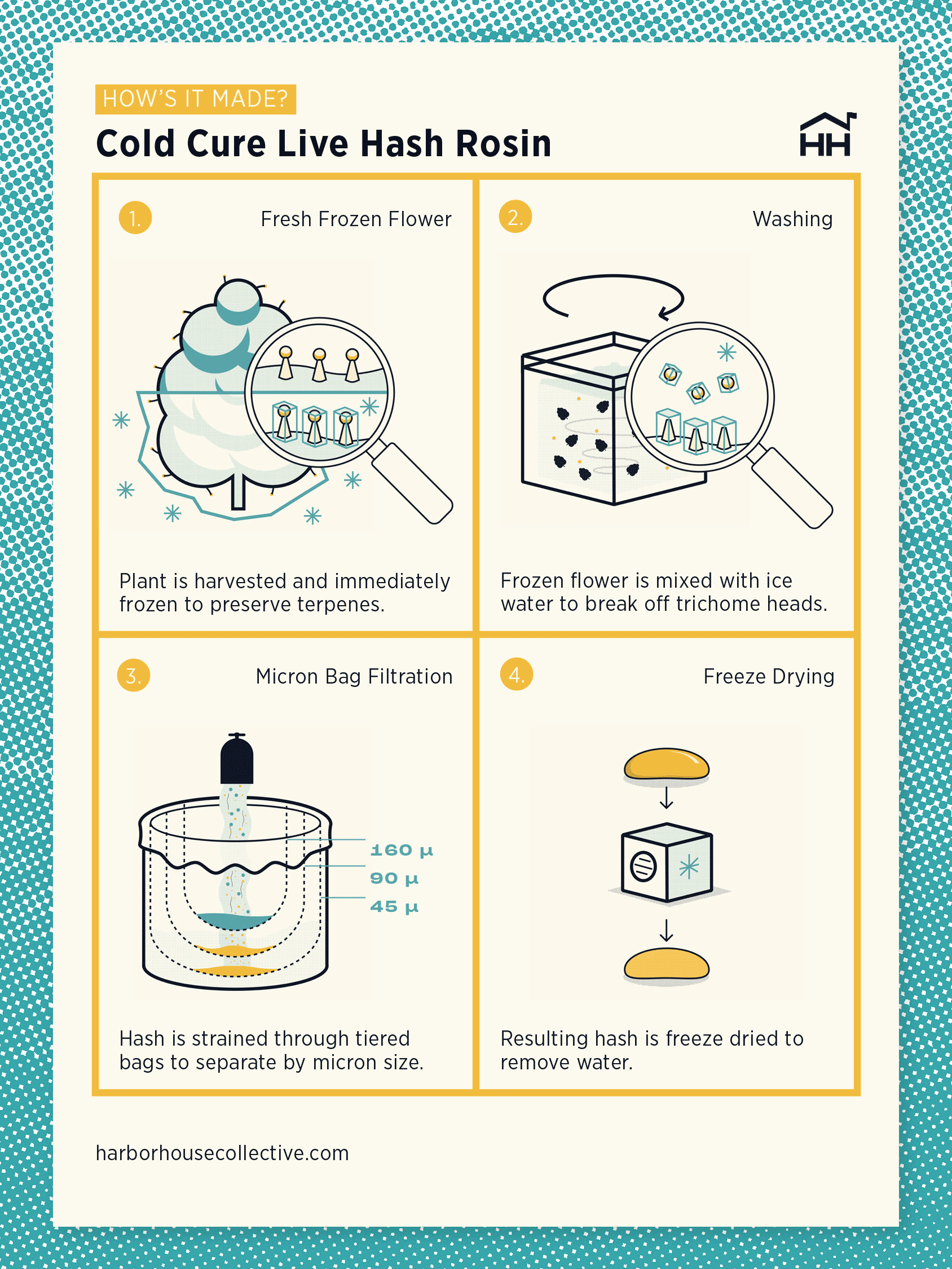
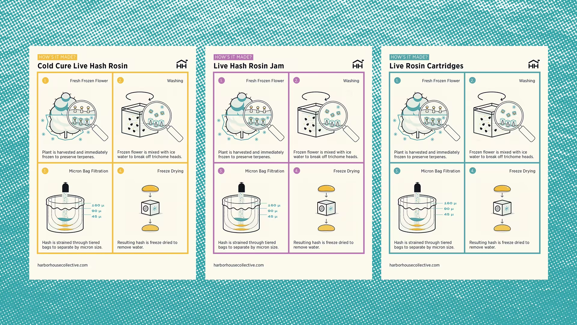
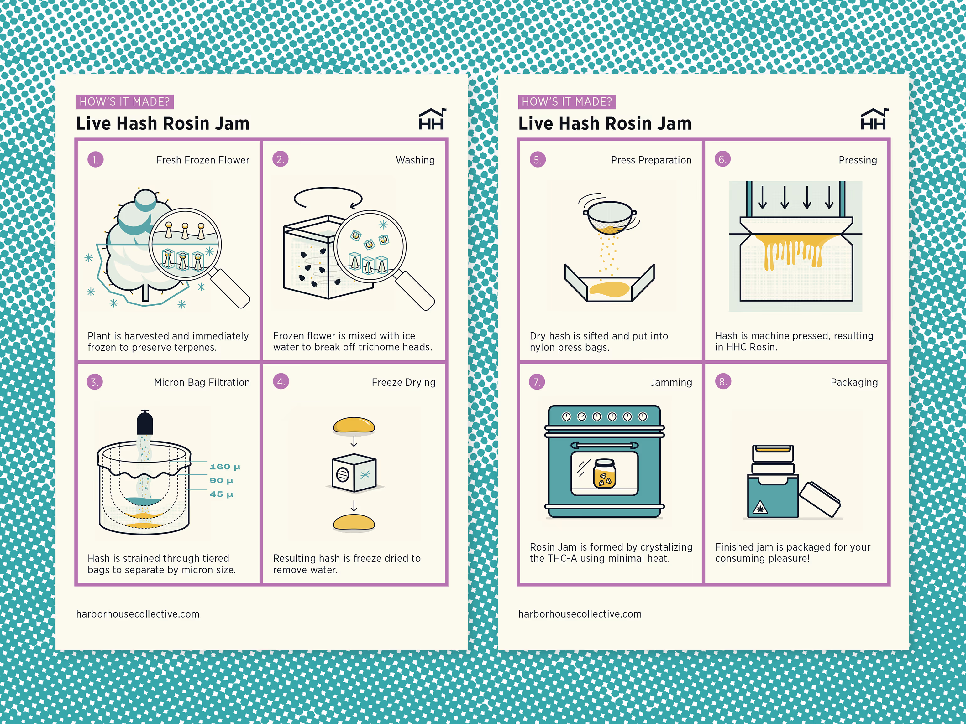
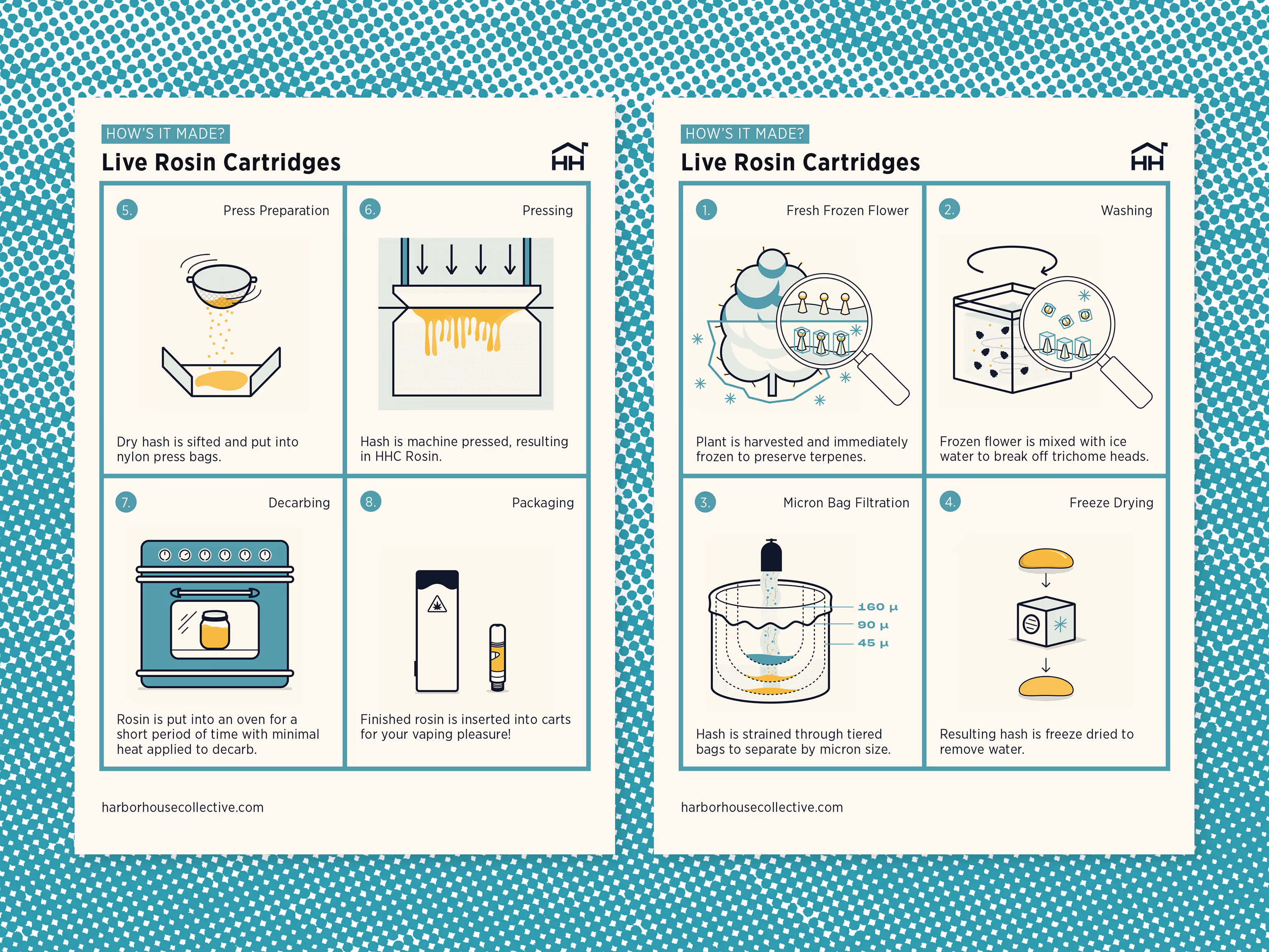
These printed cards (requested by the marketing department) explain the difference between rosin products. I spoke with the production team to learn the process, broke it into steps, and then made it visual. The cards were a hit and still populate dispensaries across Massachusetts.
^
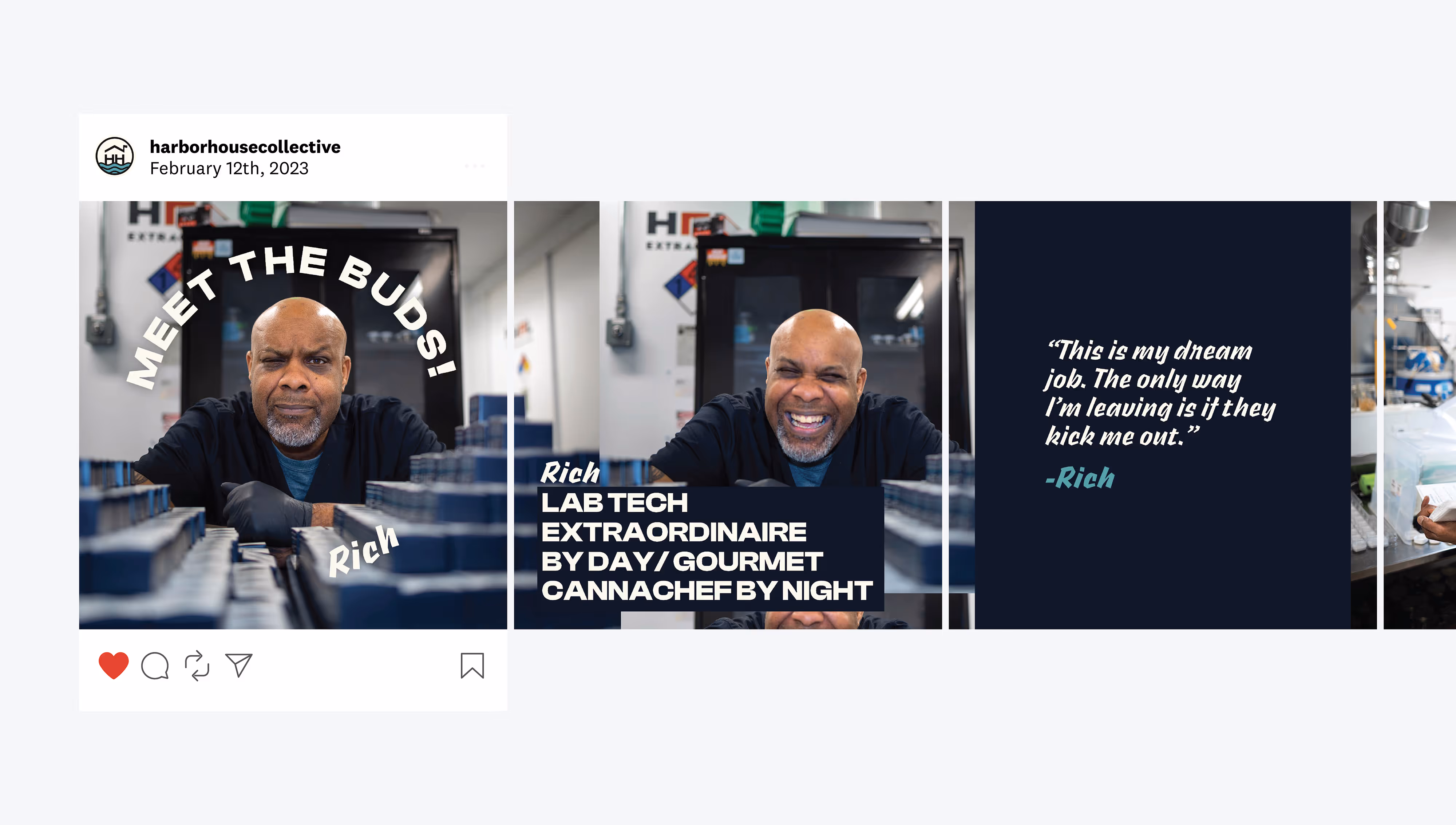
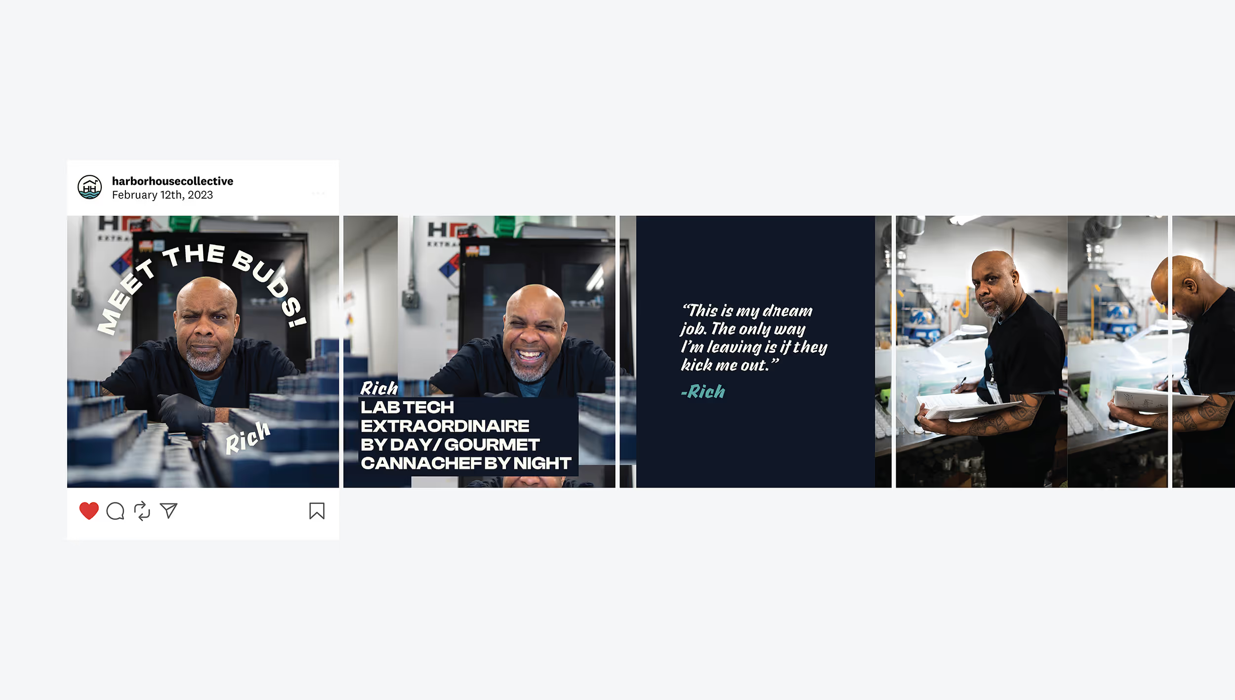
Meet the Buds was an Instagram series I created by interviewing and photographing members of the Harbor House operation. This one, featuring Rich, was the most popular.