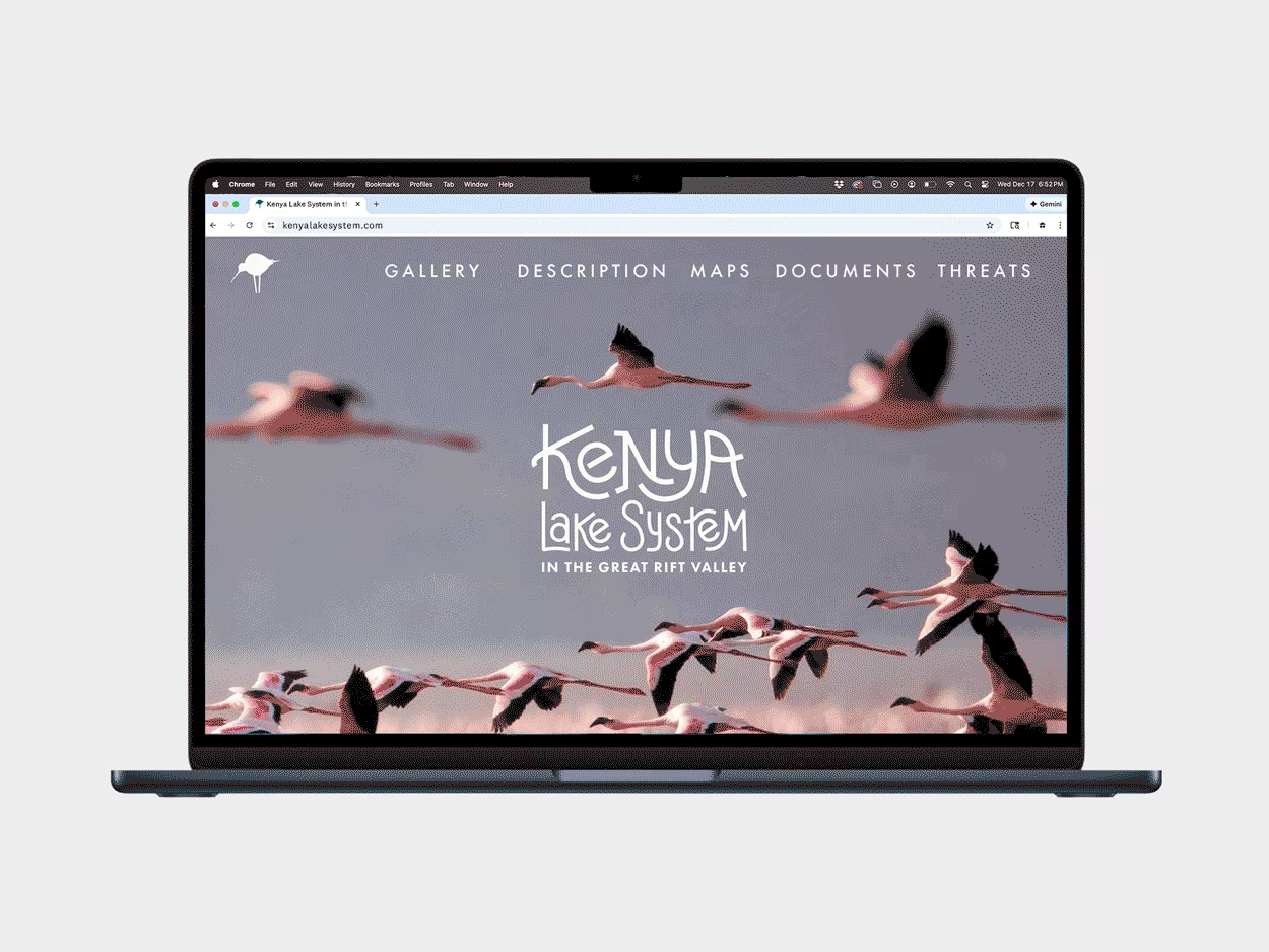
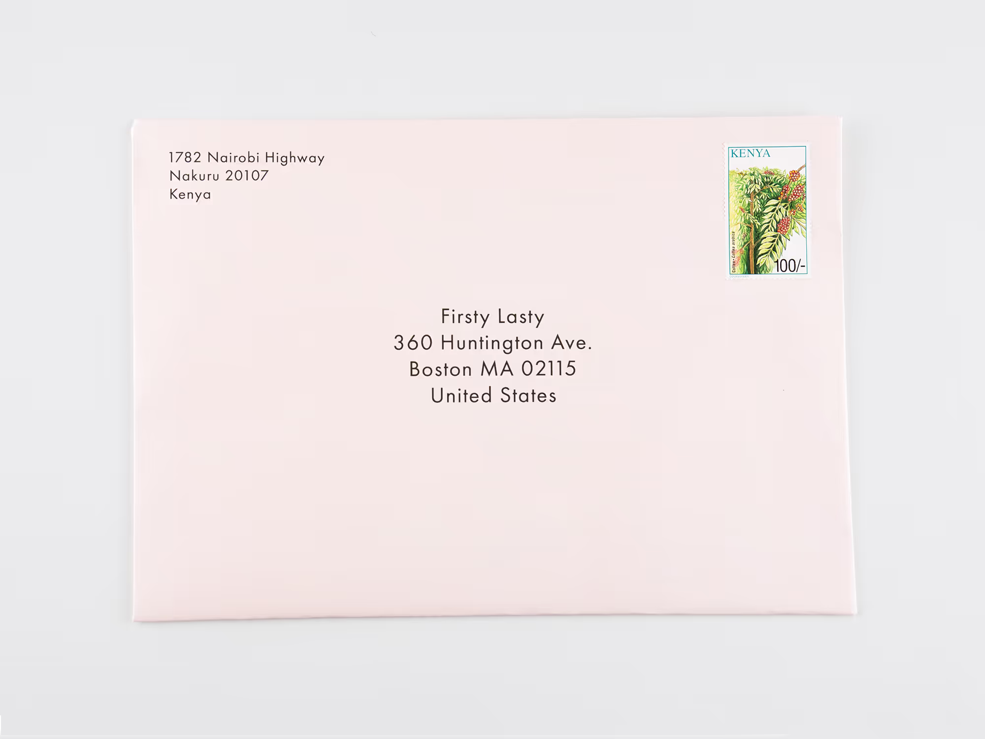
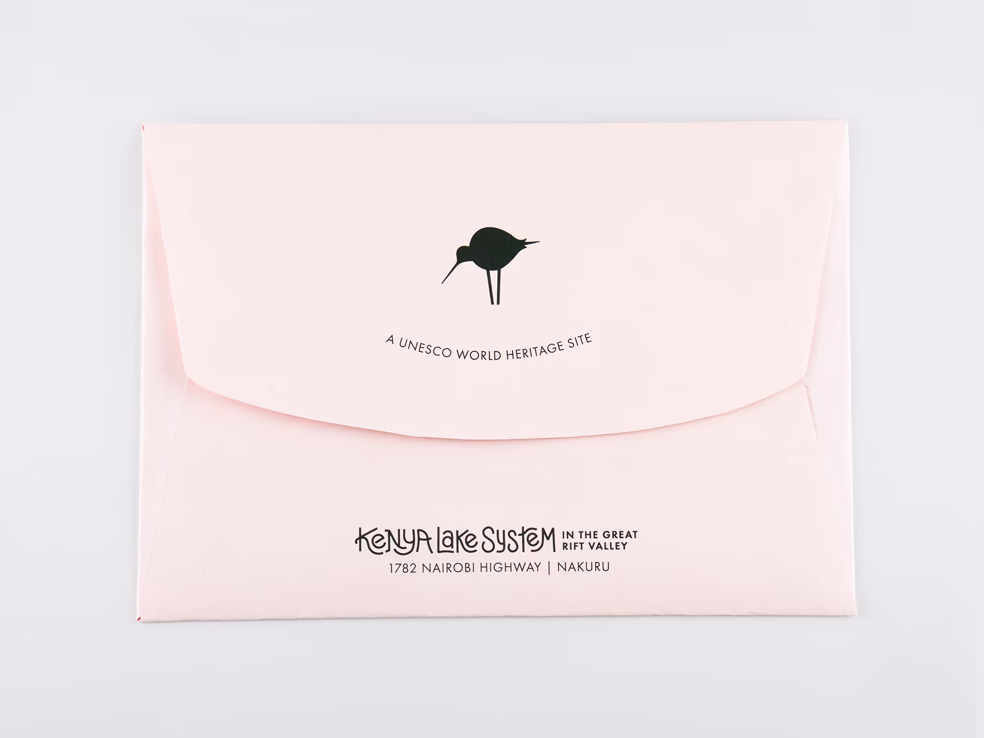
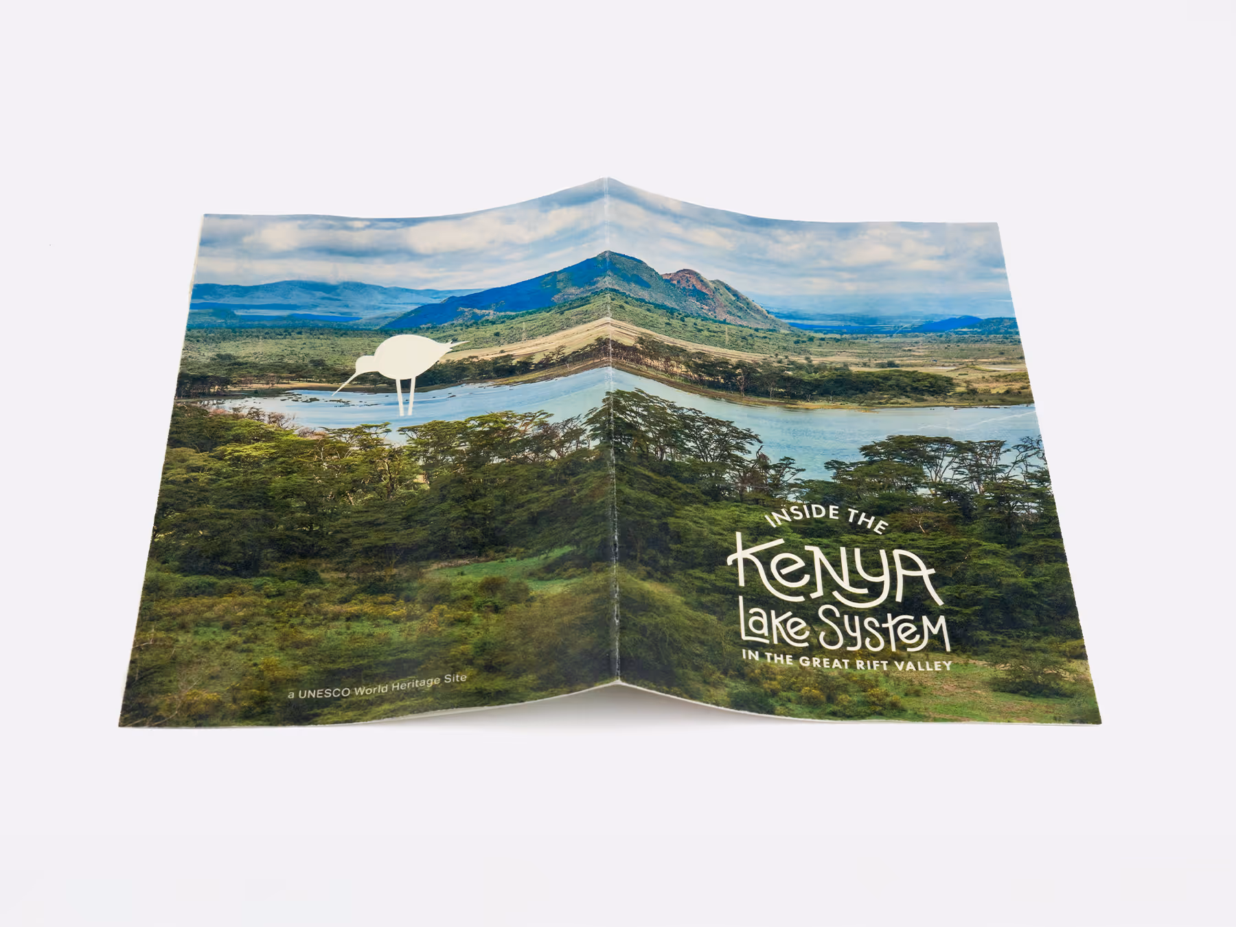
This is a brand concept for the UNESCO world heritage site: the Kenya Lake System in the Great Rift Valley. The system is designed to be playful and fun without ignoring the scientific relevance of the environment.
^
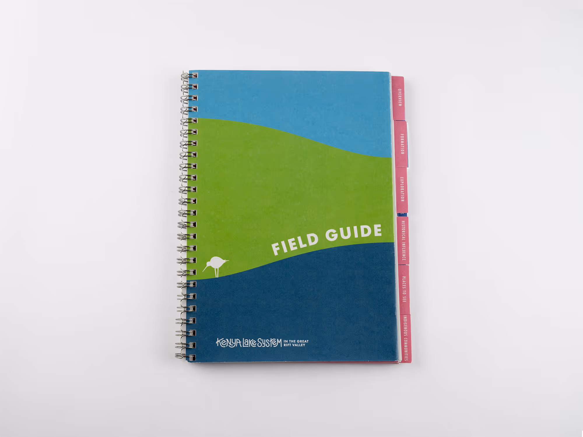
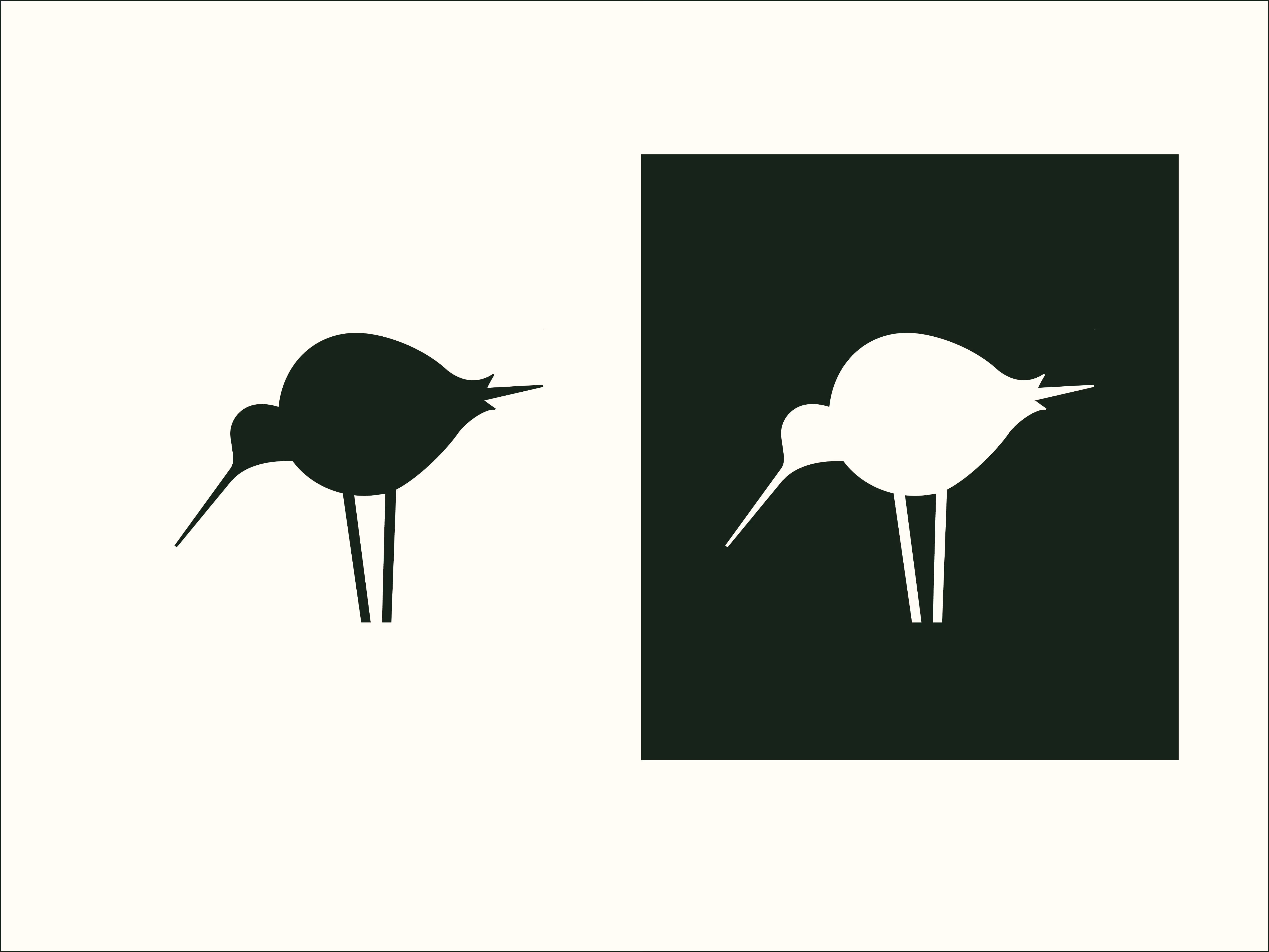
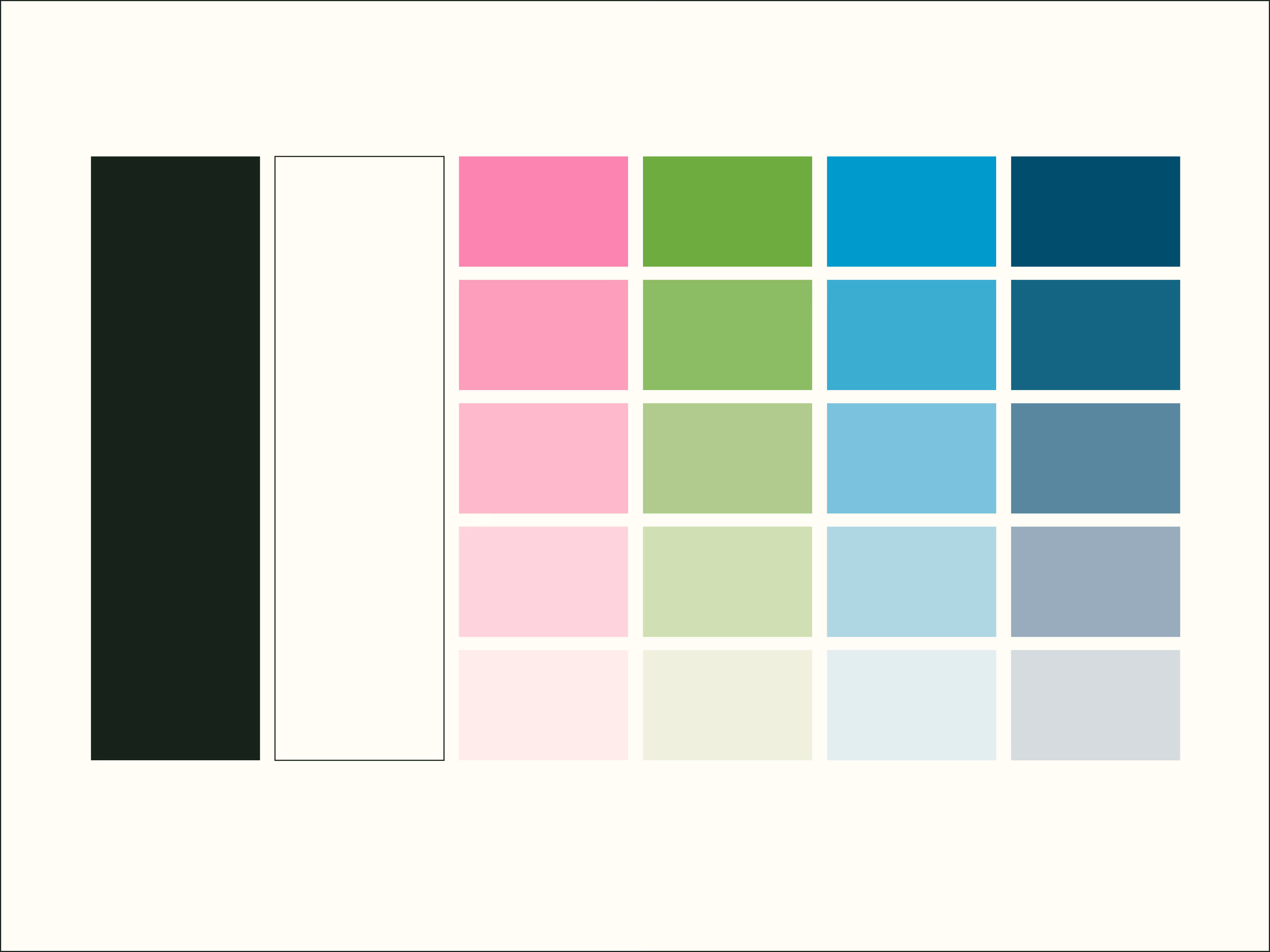
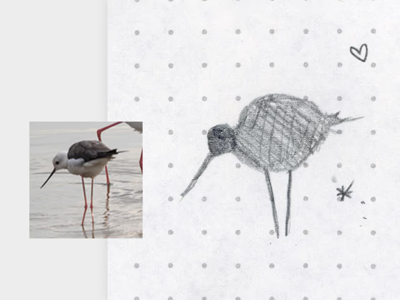
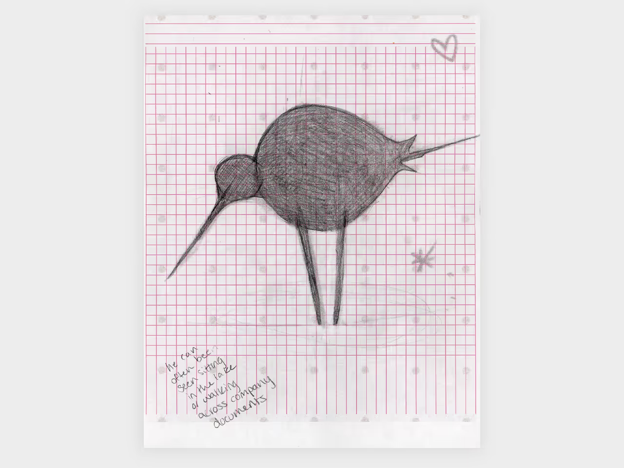
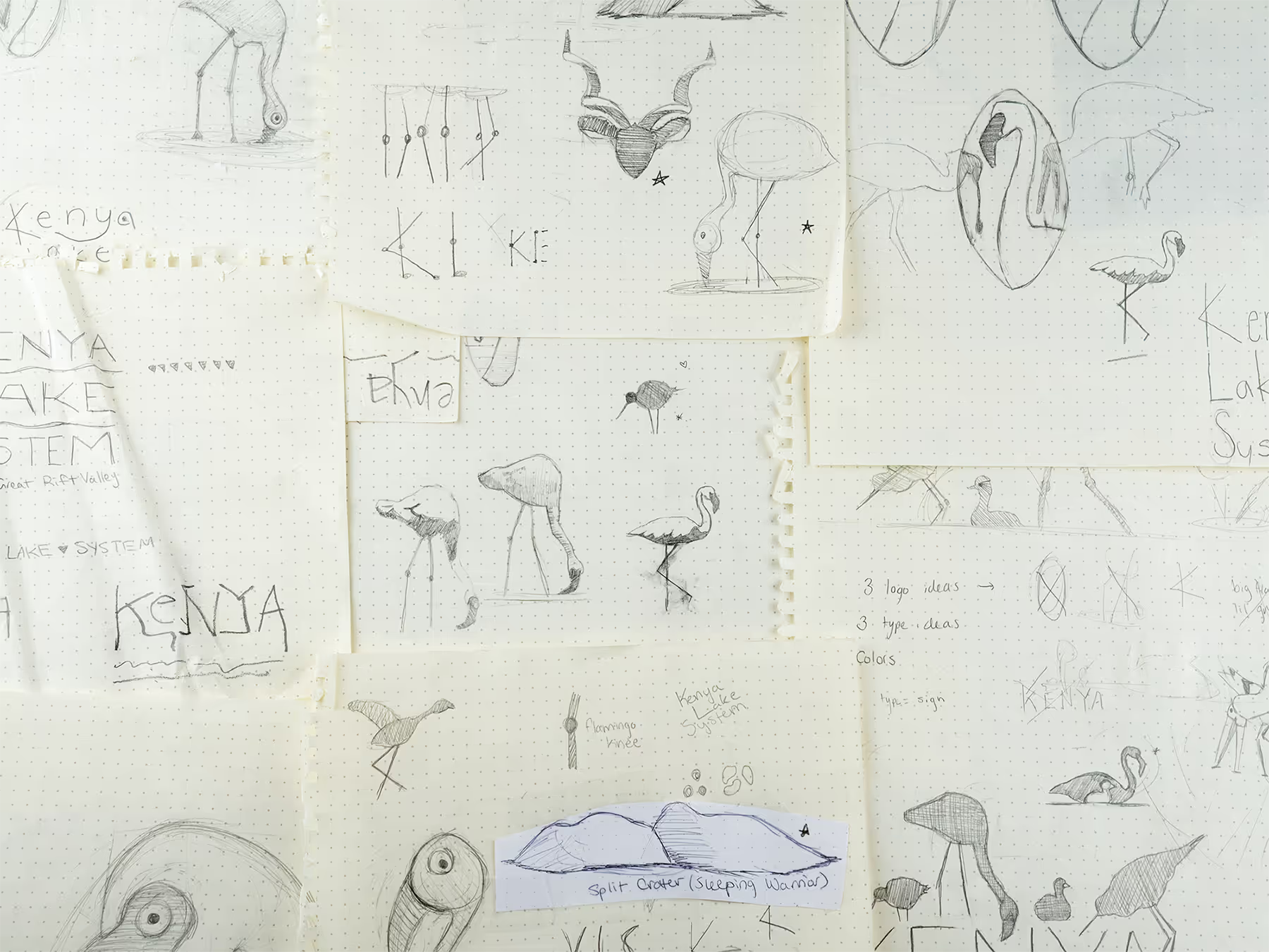
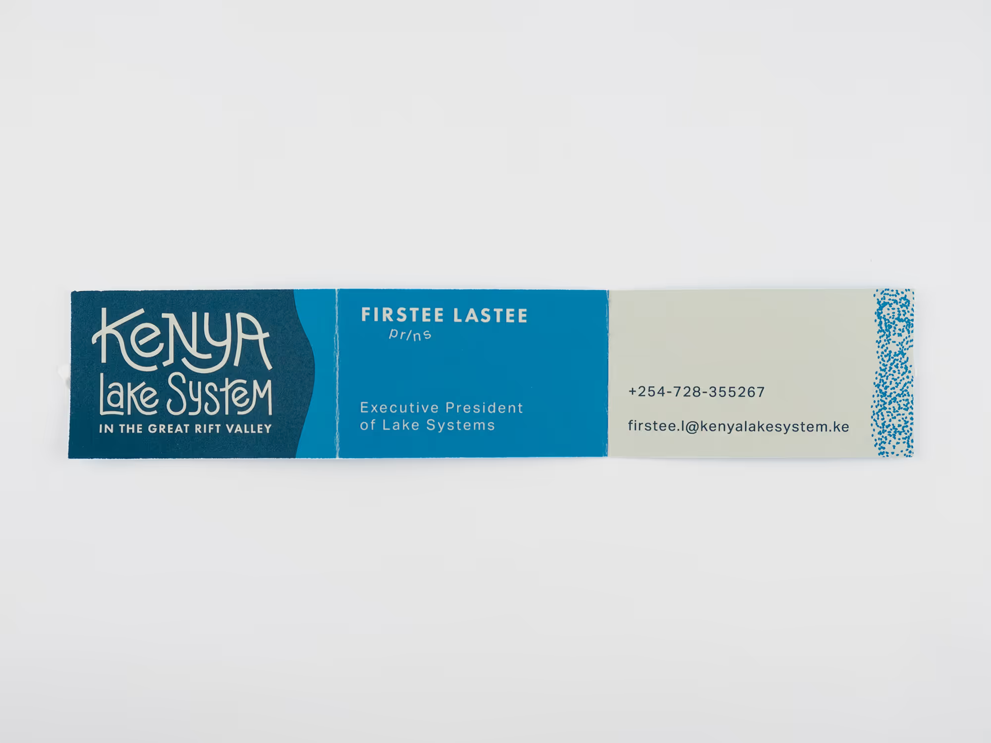
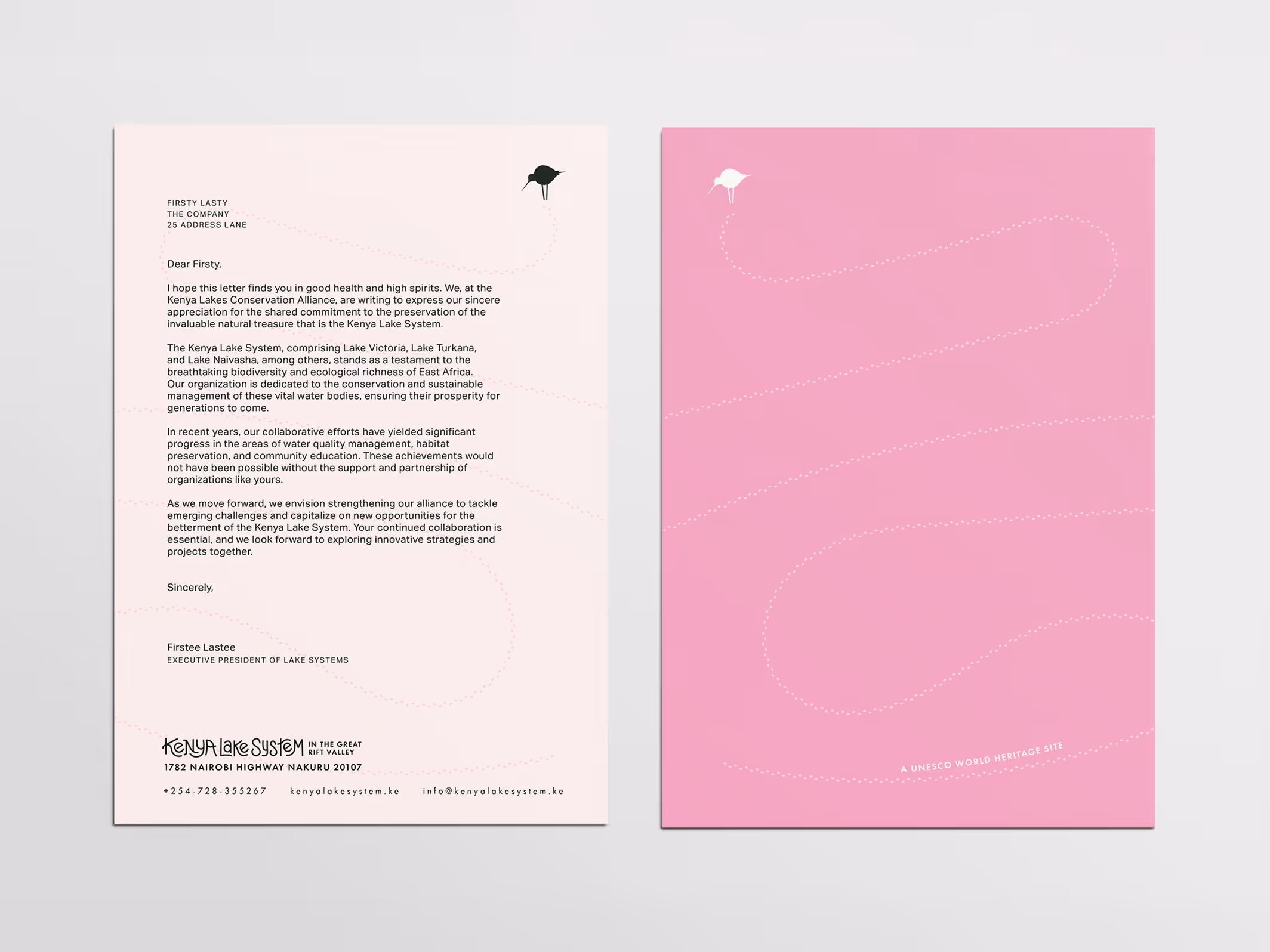
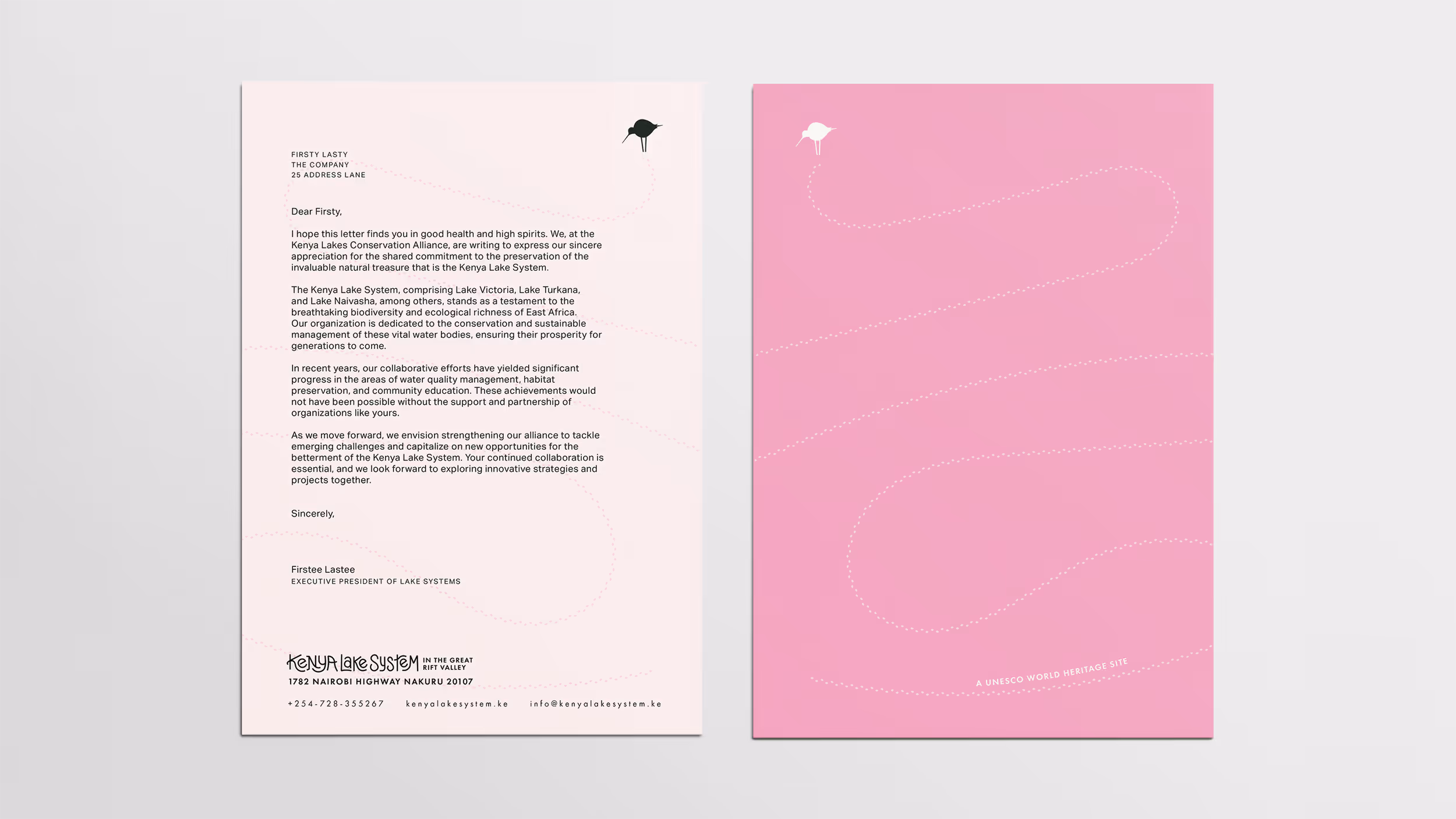
I drew this logo off the silhouette of a black winged stilt standing in water. The Kenya Lake System is famous for its flamingo population, but it supports one of the most diverse bird populations on the planet. Choosing a non-flamingo was my way of shining a light on that diversity. Still working them in, I chose pink as the only color in the palette not evoked by the natural environment (two blues for the lakes at different times of day, green for the grass, a pondskummish alkaline black, and a sandy off-white). The wordmark is inspired by the natural slopes and valleys of the environment and the winding tracks animals leave in the earth.
^
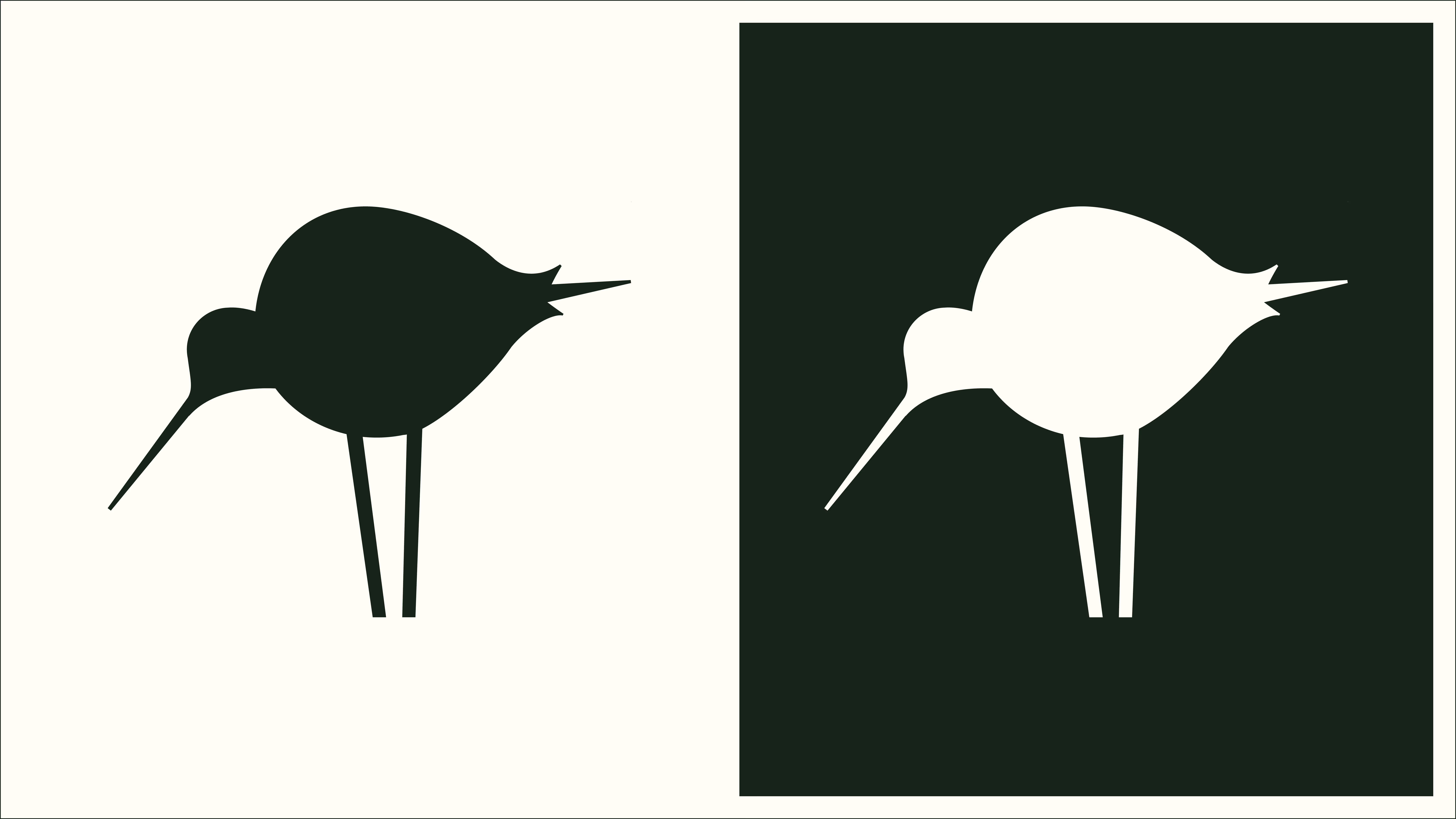
I made the original tracing with a pencil and a lightboard. It is no taller than a half inch, but something about it immediately jumped out to me. Next, I printed it scaled-up on an 8.5x11 piece of paper and refined the forms closer up.

^
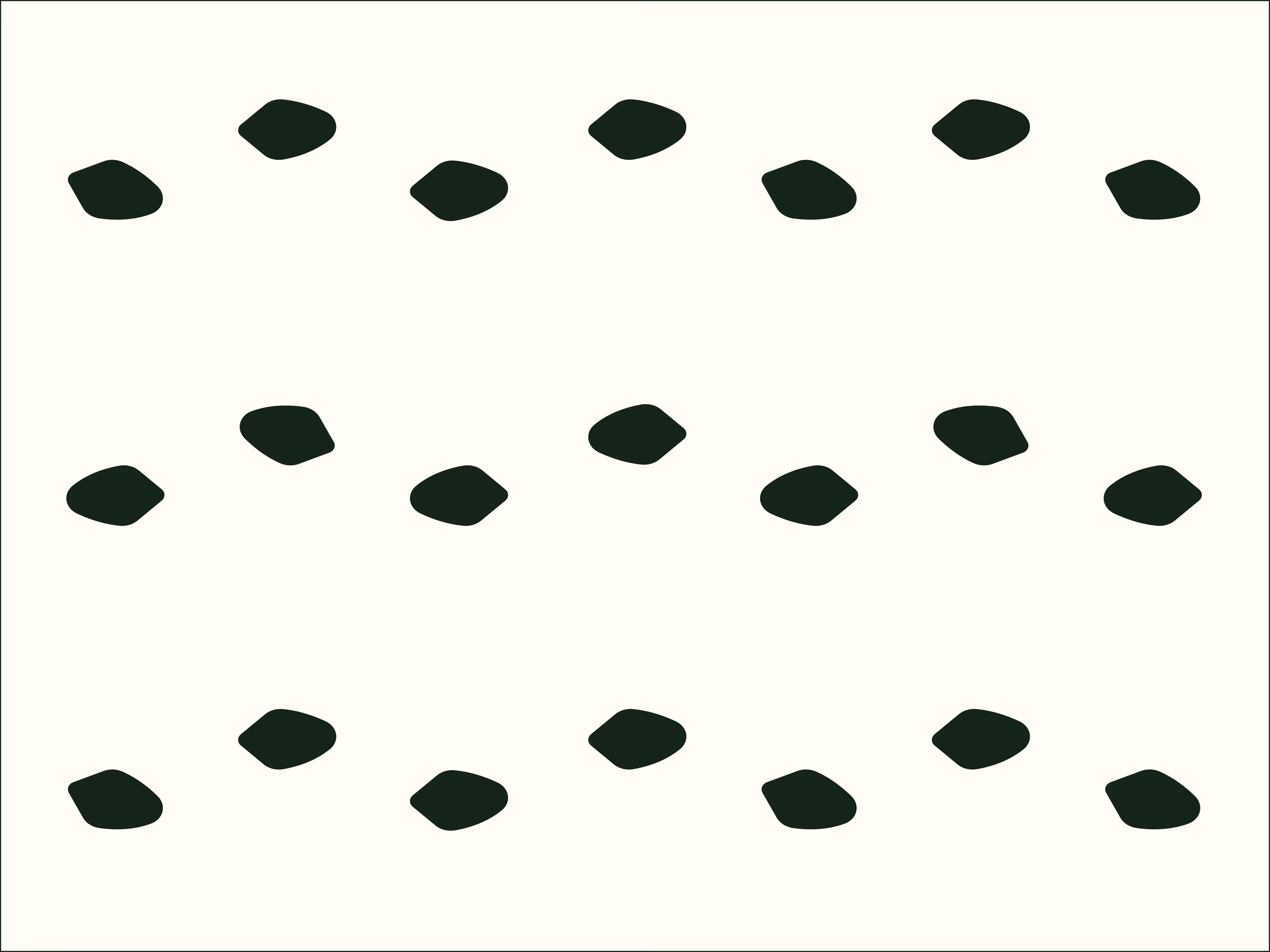
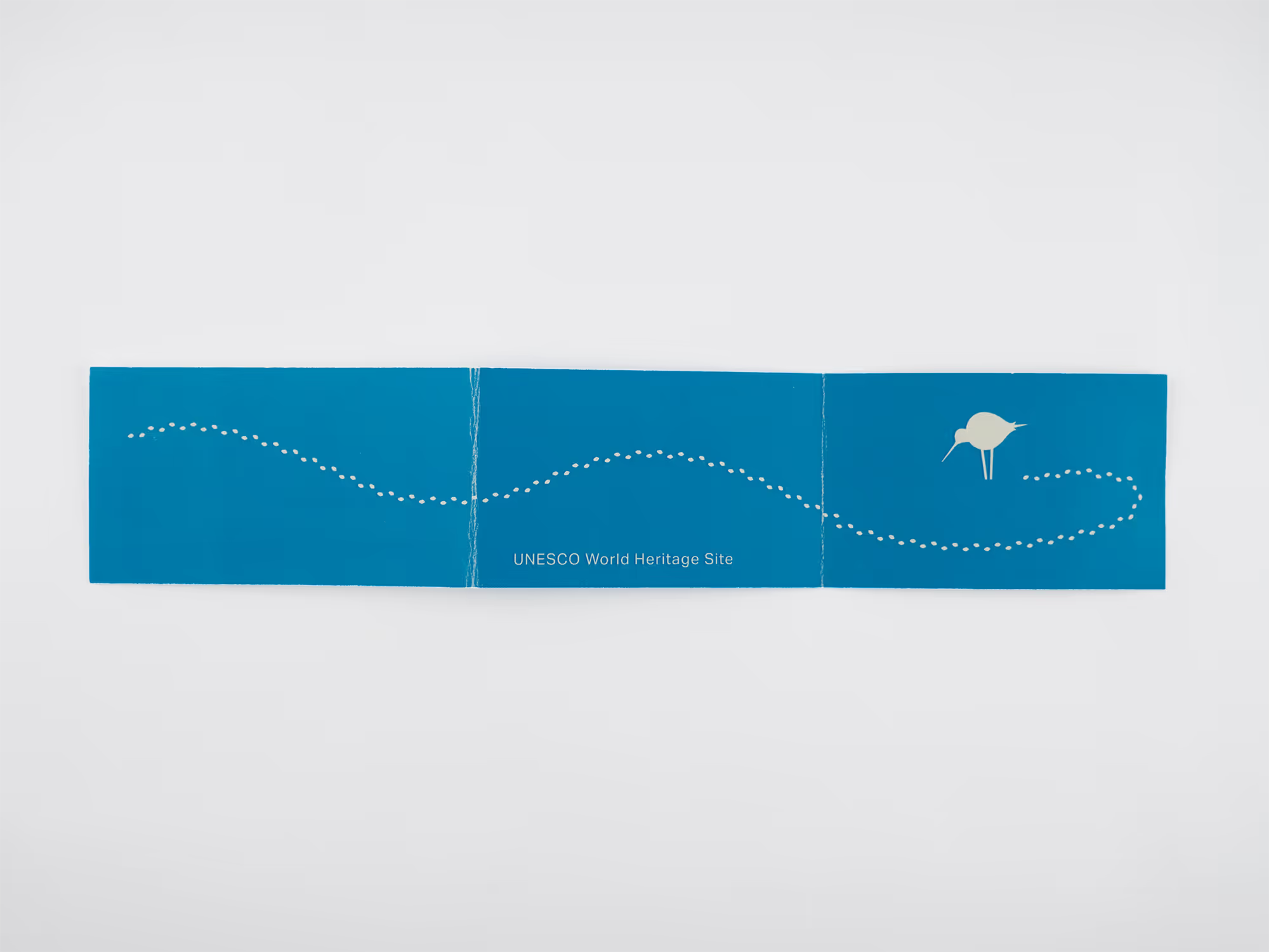
In order to bring migration into the visual storytelling, I created a webbed footstep brush in illustrator. These little abstract bullets proved immensely useful for creating textures of varying density across all touchpoints.
^
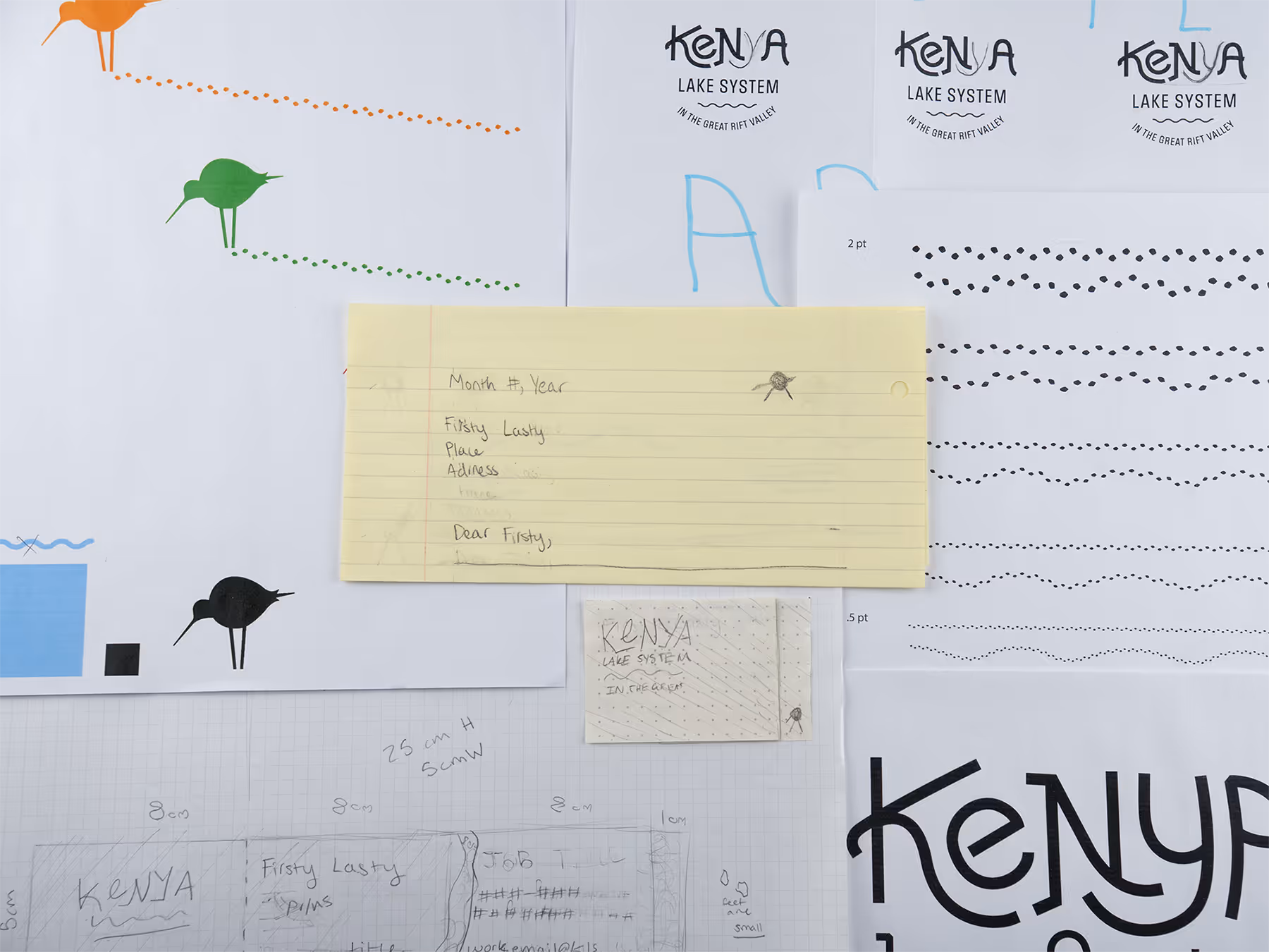
I relied heavily on paper and pencil throughout the process of developing every part of this project. Many of the elements were designed for print, so viewing them at scale was essential.
^
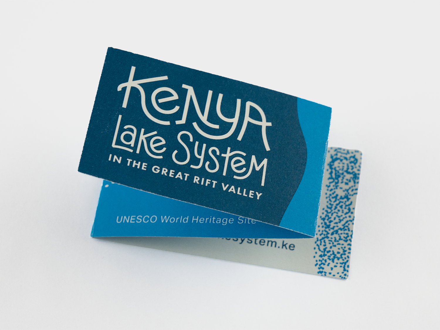
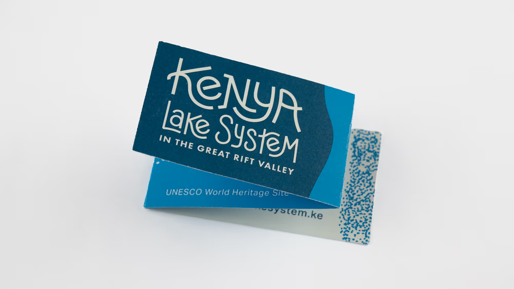
For the business card, I decided to play with a long piece of paper that folds into the profile of a traditional business card. This opened extra space for longer names and carries through the playful nature of the brand.
^
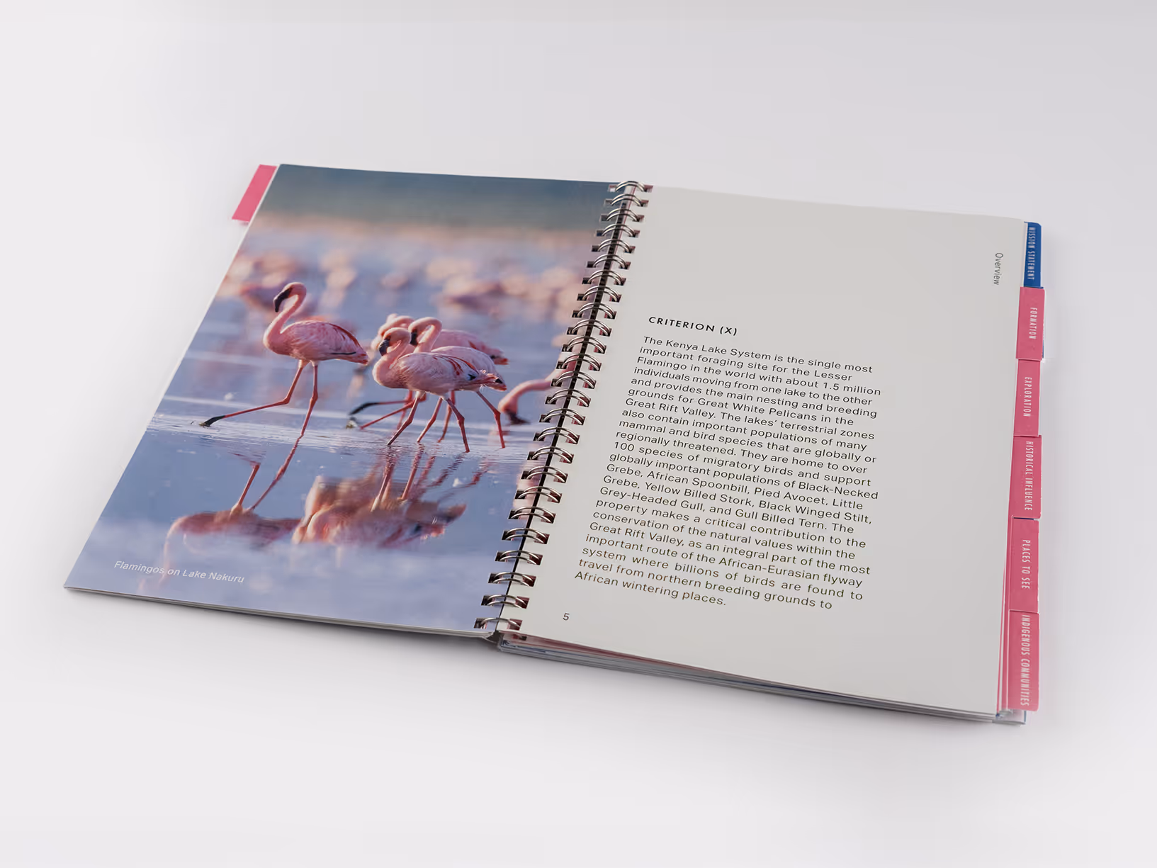
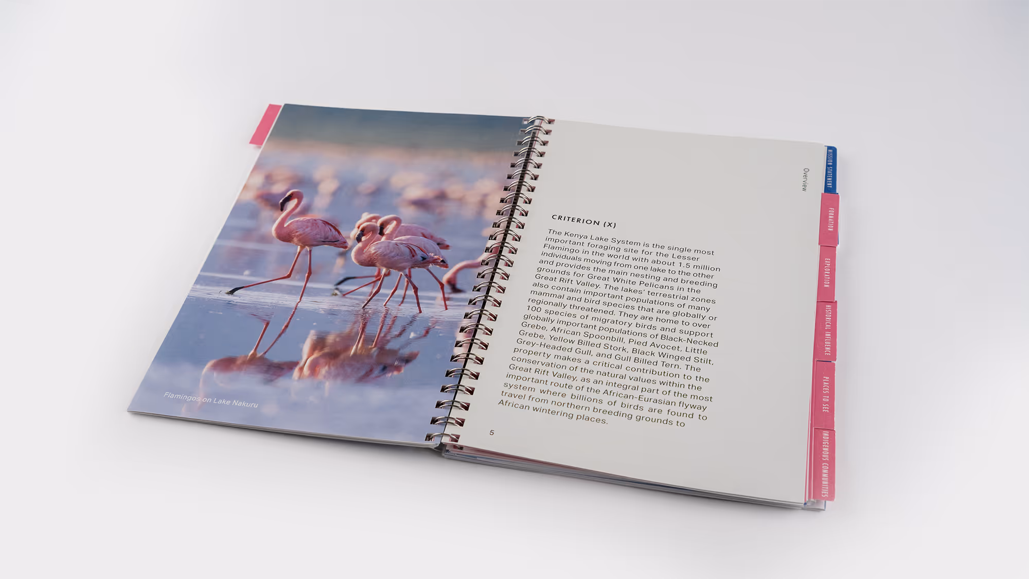
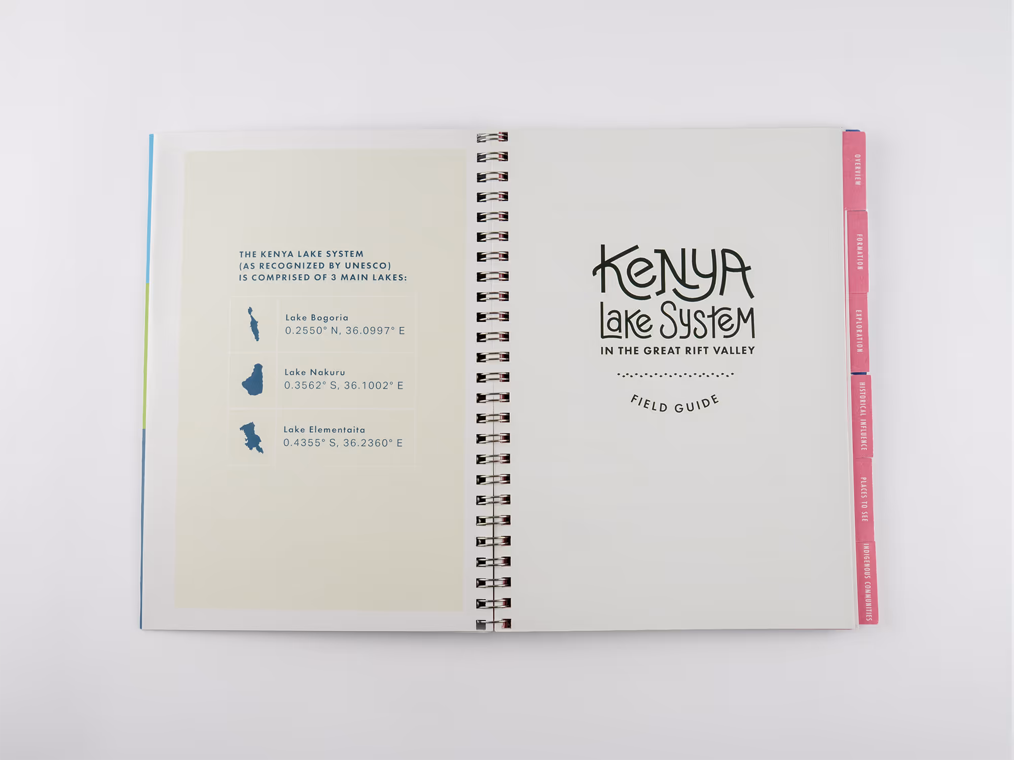
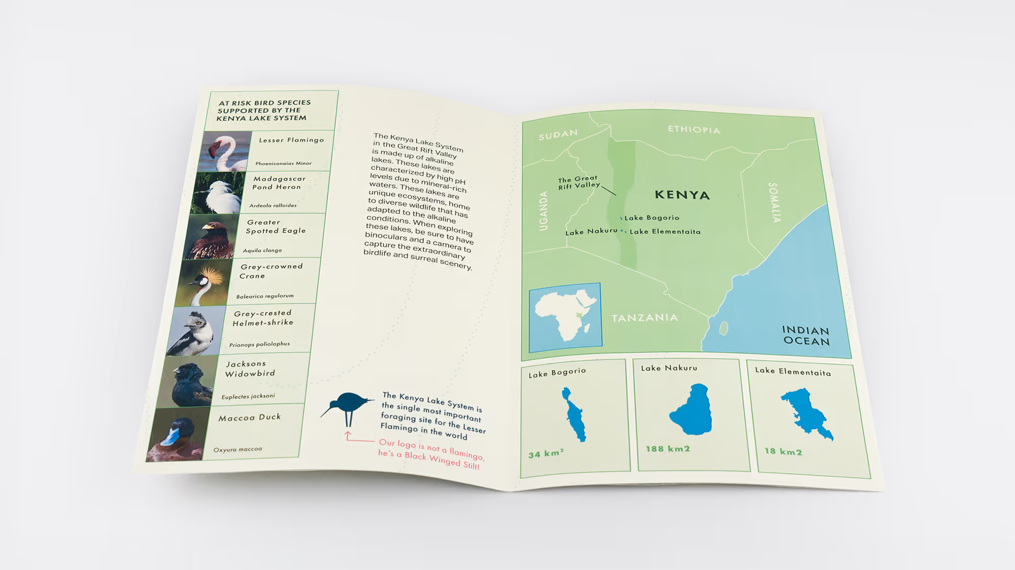
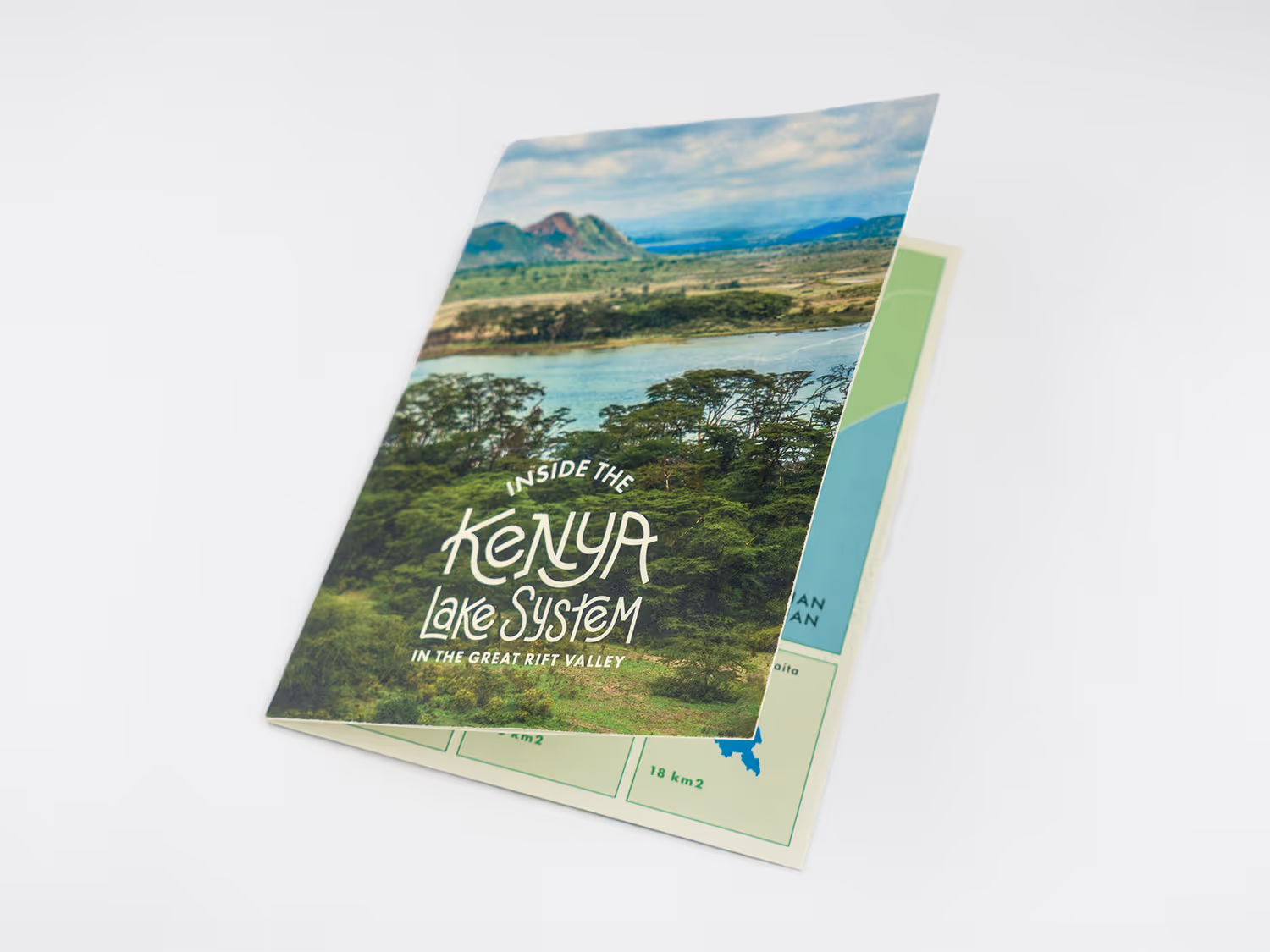
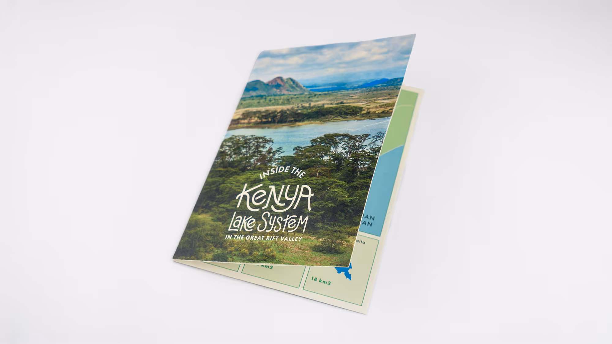
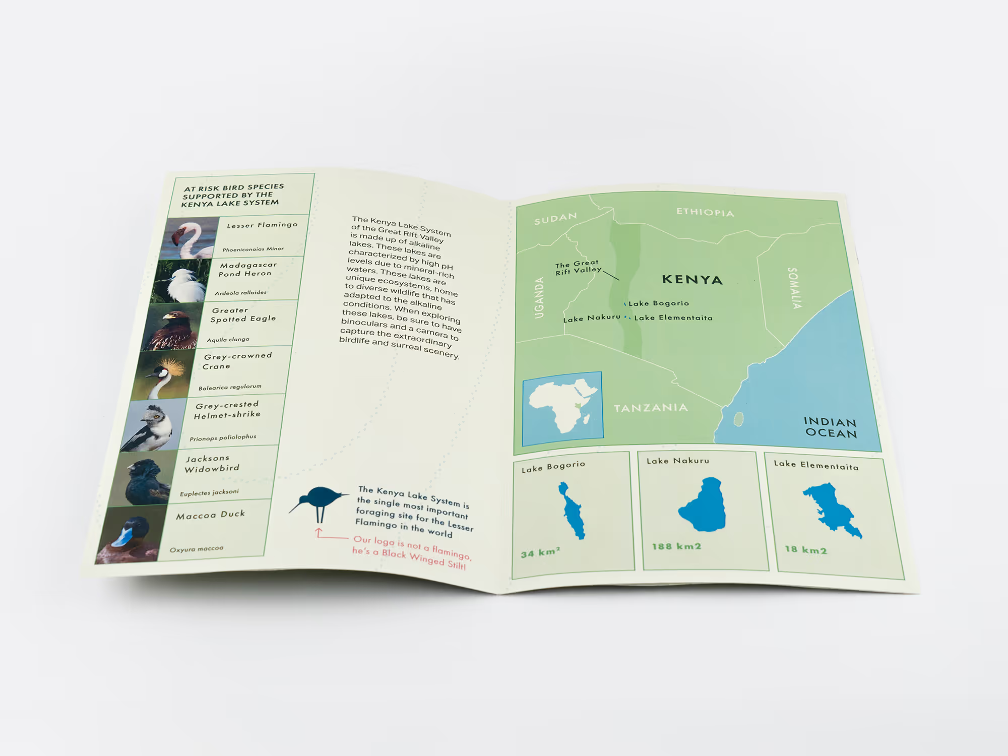
This info page is designed to give visitors a fast introduction to the Kenya Lake System. With so many birds to choose from, I intentionally selected a line up where no two looked the same.
^
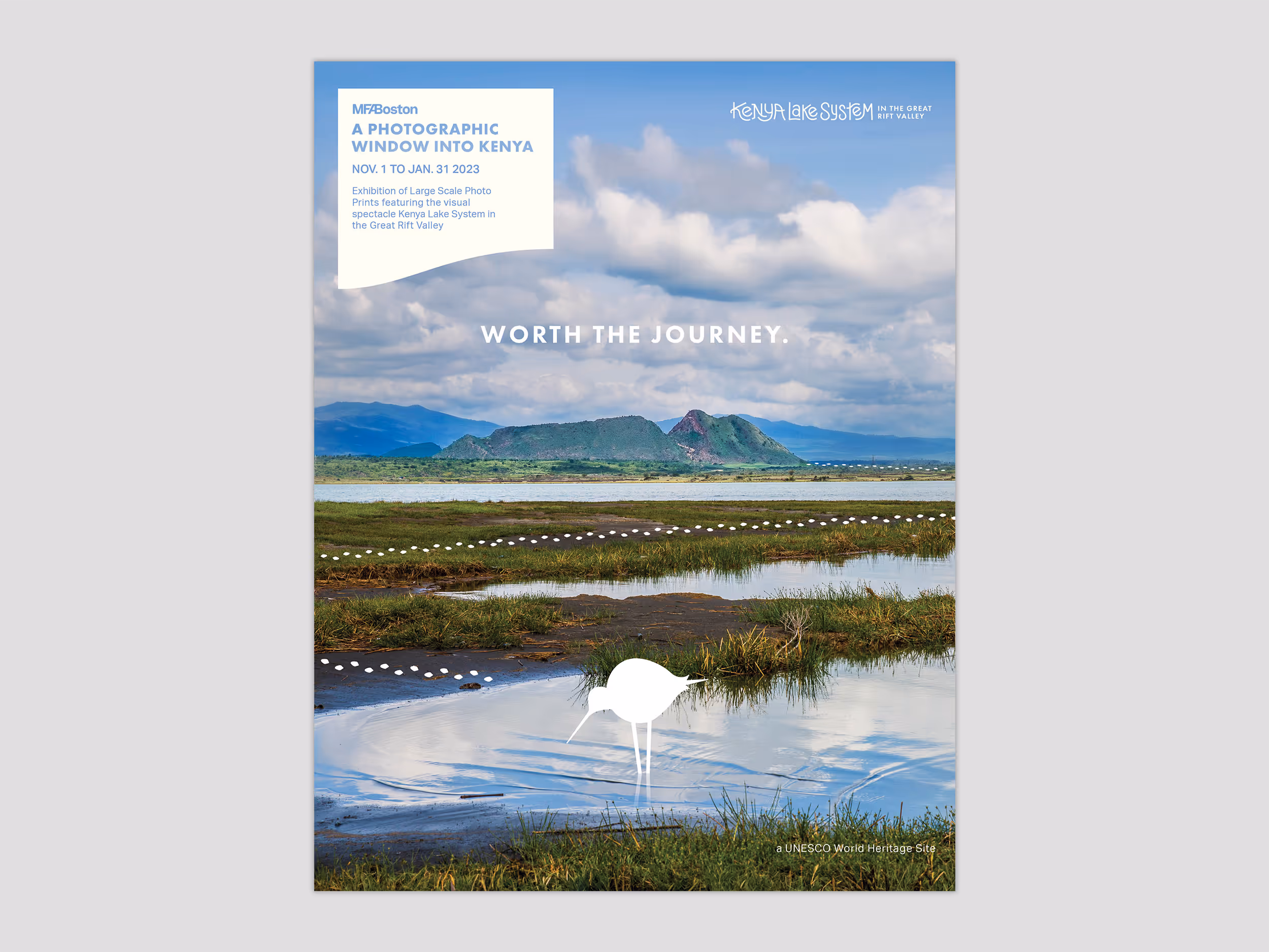
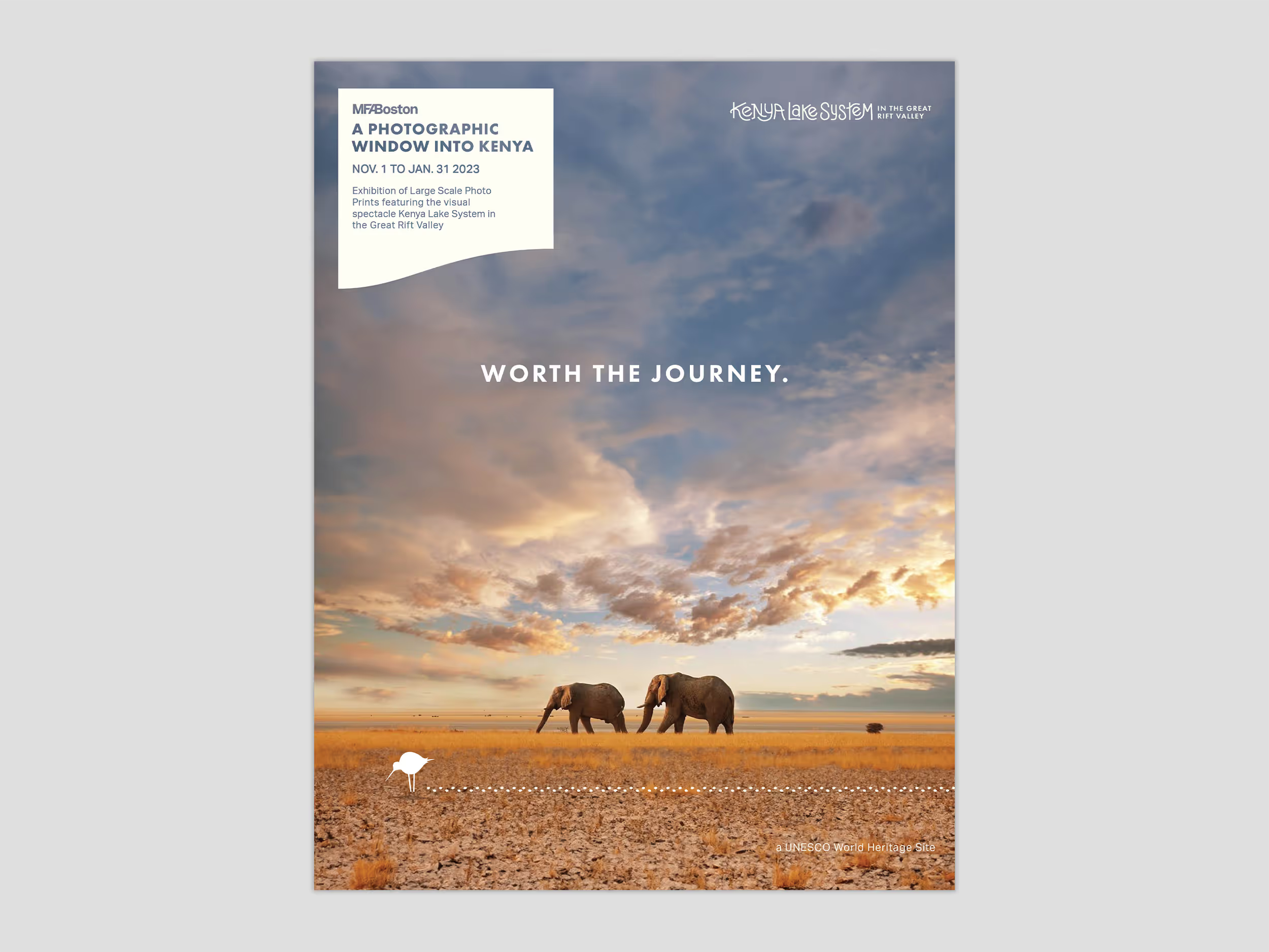
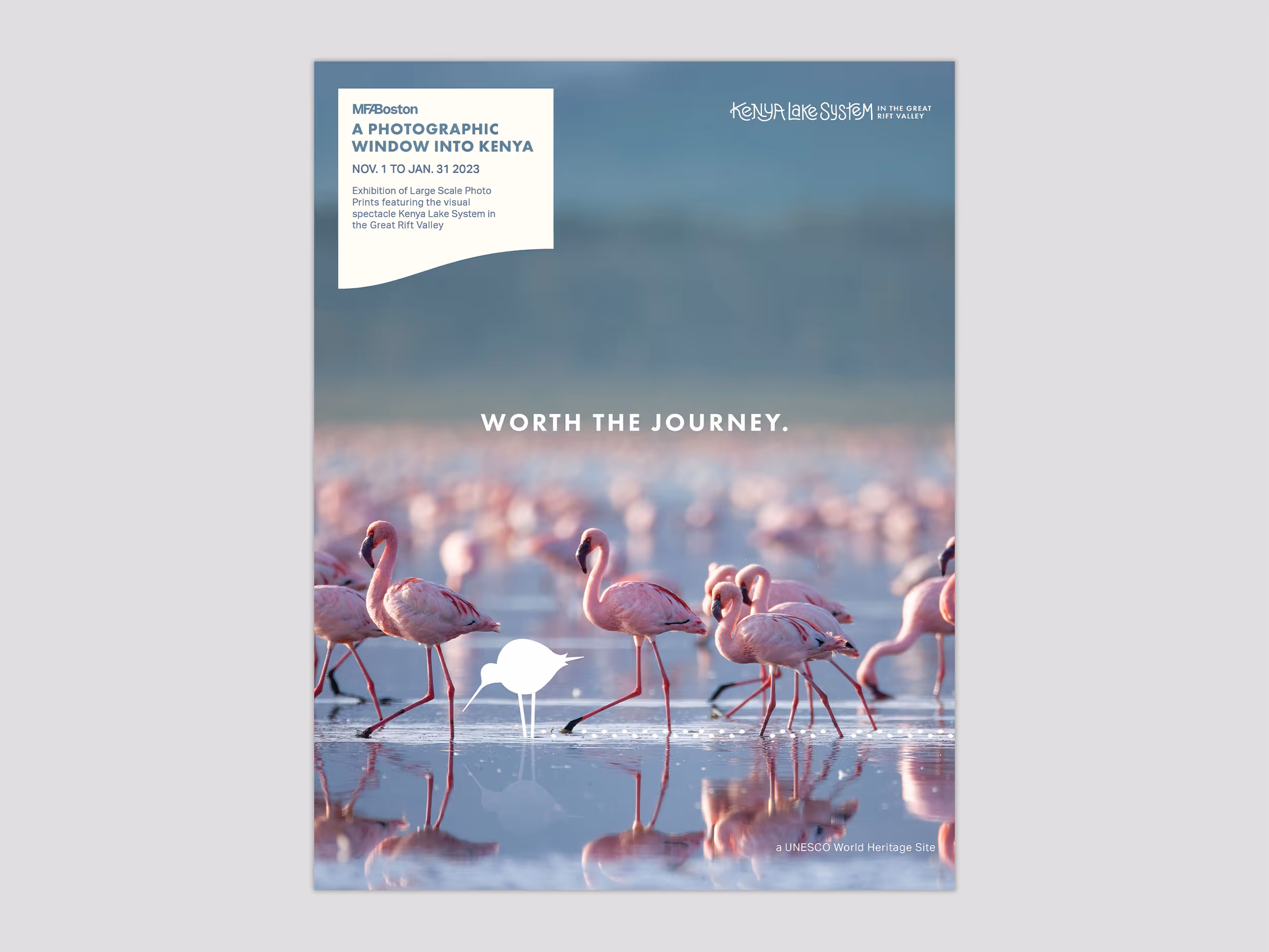
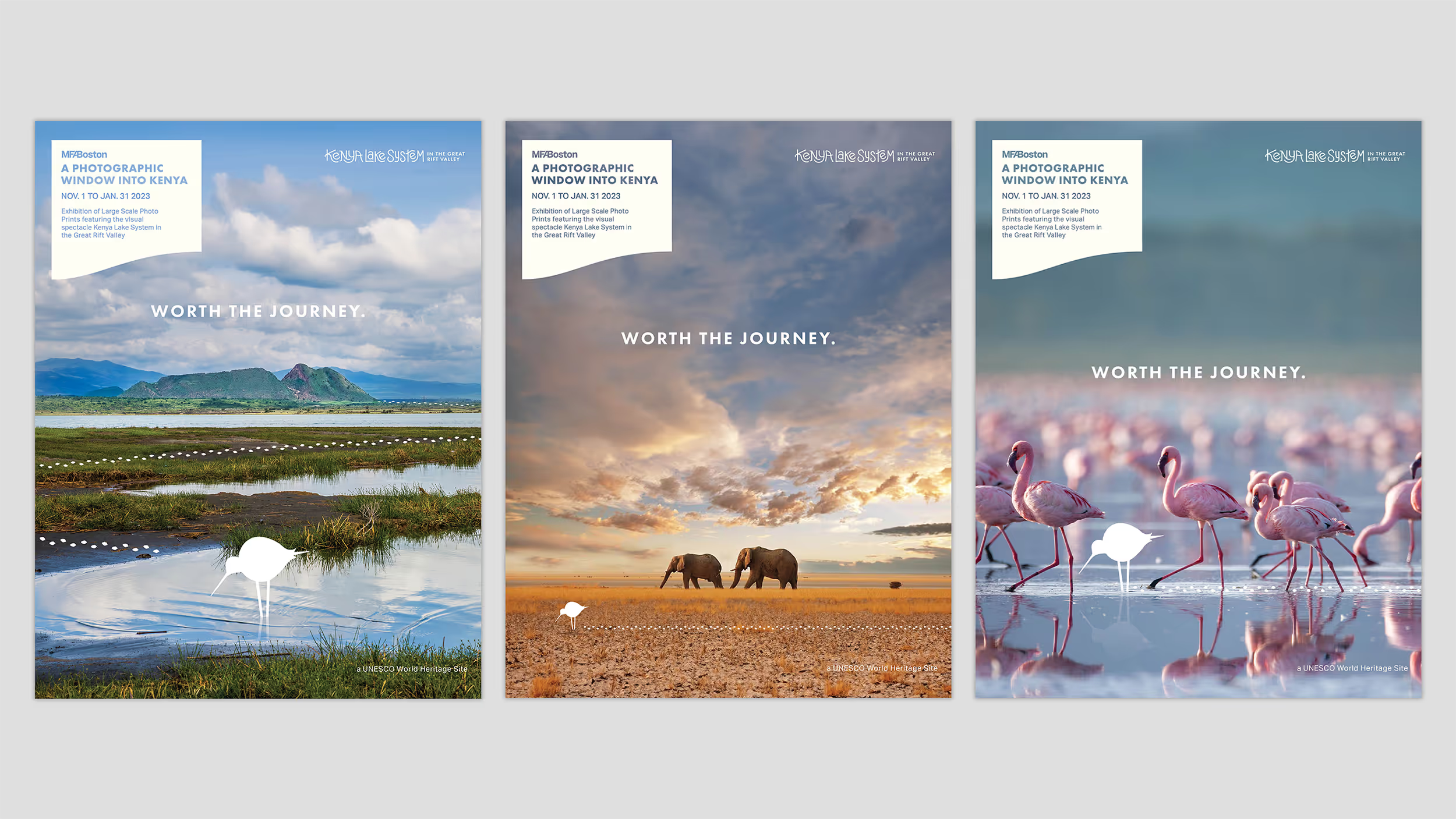
These are cobranded advertisements for a photography exhibition at the MFA. I strategically organized the brand materials and information to create a dual ad with a tagline that applies to a museum trip or a trip to Kenya.
^
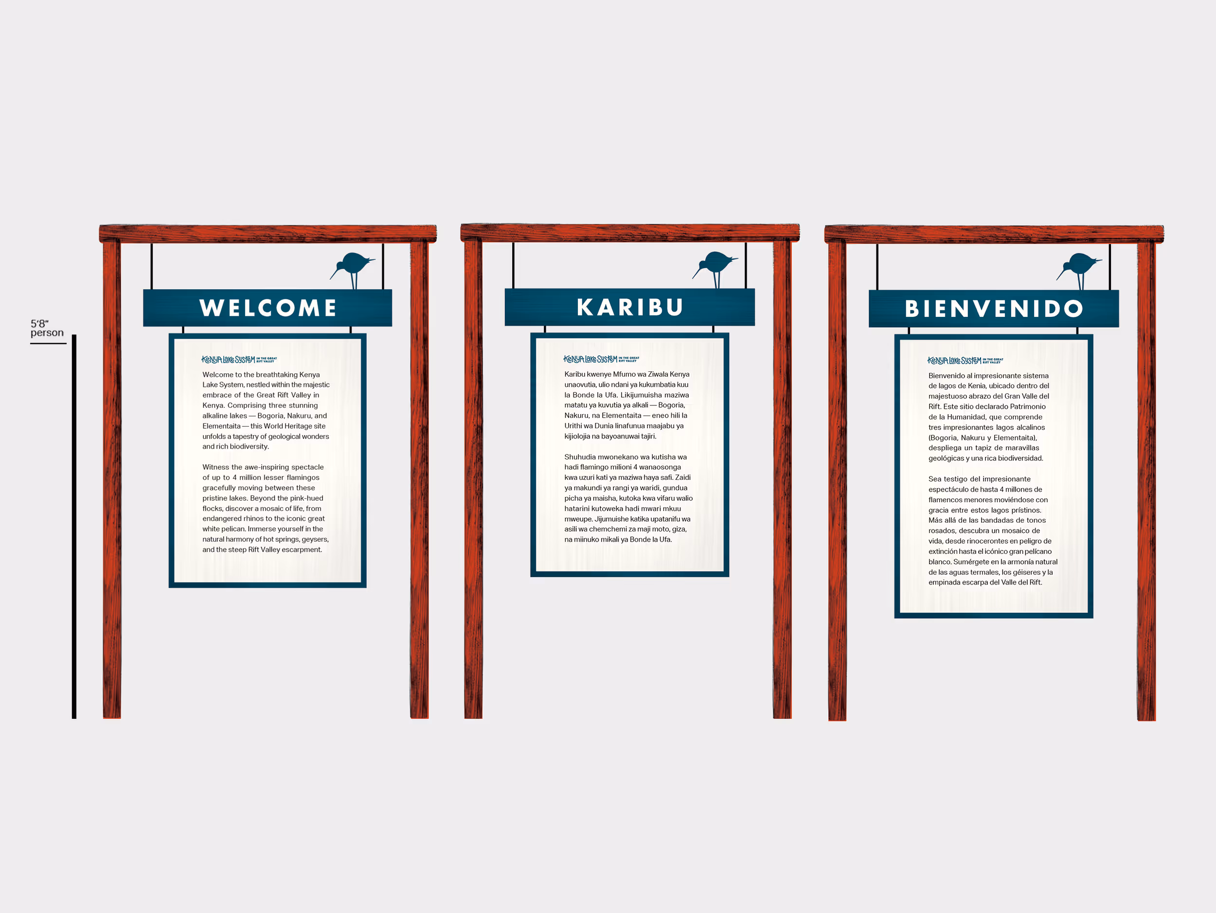
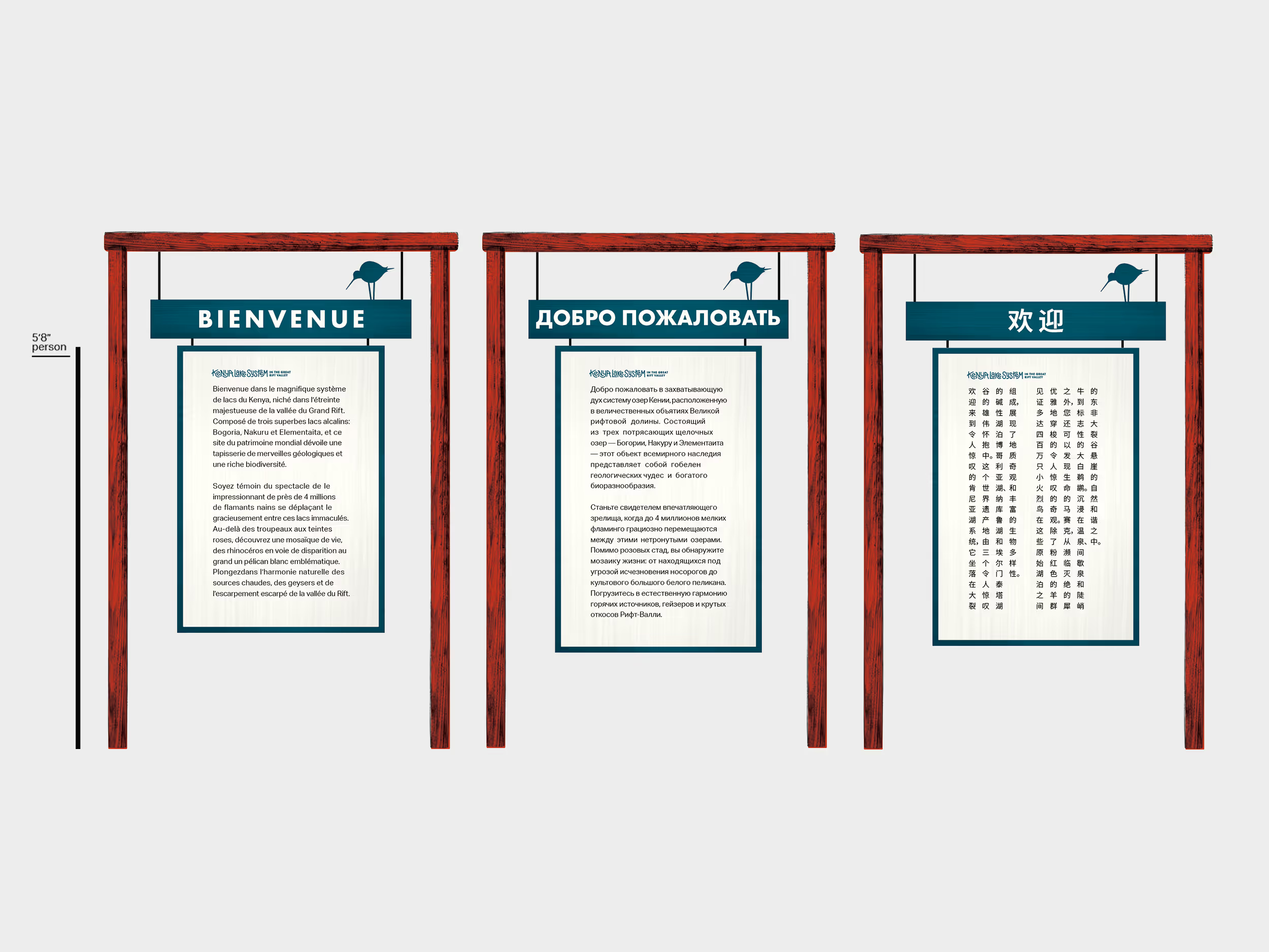
The form and material of these welcome signs is meant to fit in with the wooden signage that already exists in the area. By design, the main plate can extend to accomodate the length of the text no matter what language it is translated into.