This is a concept for a rebrand of TransTape®, a chest binding product for Transgender individuals.
Before
After
^
I designed the Topform brand to evoke something classic and familiar by spending time looking at vintage American packaging. I found particular inspiration in an old Red Cross Bandage box I found on ebay. The brand is purposefully bold and honest about the product while remaining appropriate for drug store shelves.
^
My Topform wordmark uses Ultramagnetic Bold Oblique, chosen for it's rounded corner tapelike details. For the rest of the brand typography, I went with Klim's National 2 for some more classic Americana without feeling dated. All the brand colors were designed for print first.
^
These are the initial concepts for the brand identity before I settled on the final direction.
^
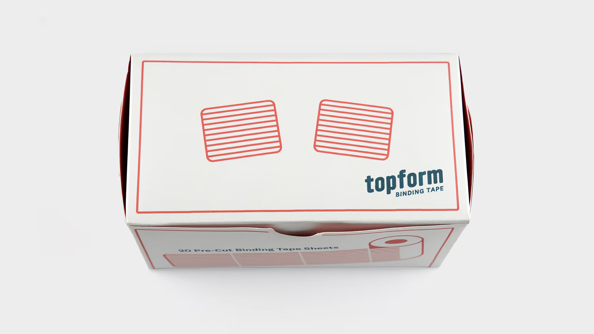
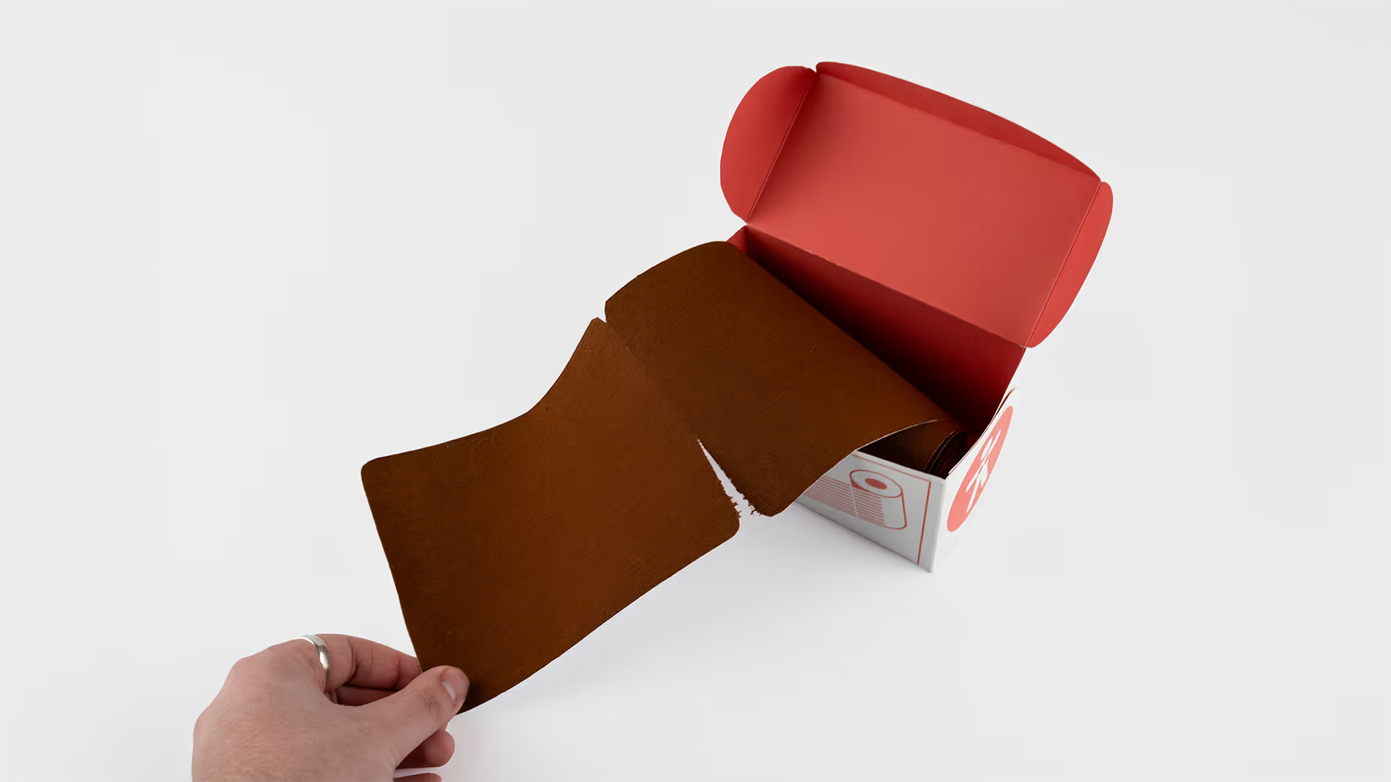
The binding tape box is the centerpoint of the brand. Red stripes and blue details on a white box evoke the American flag. Most importantly, the redesign of the box makes it much easier for the user to access the product.
^
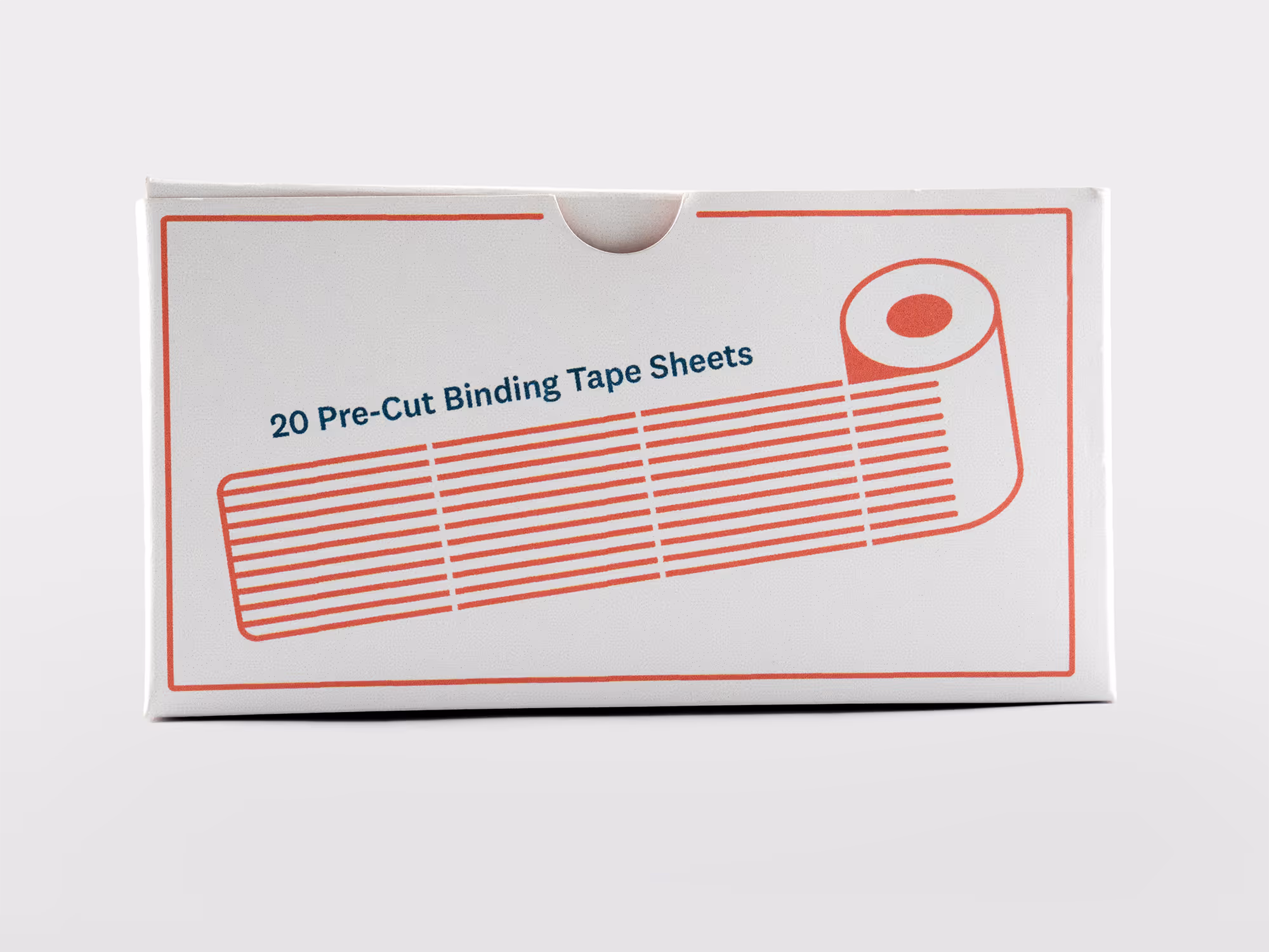
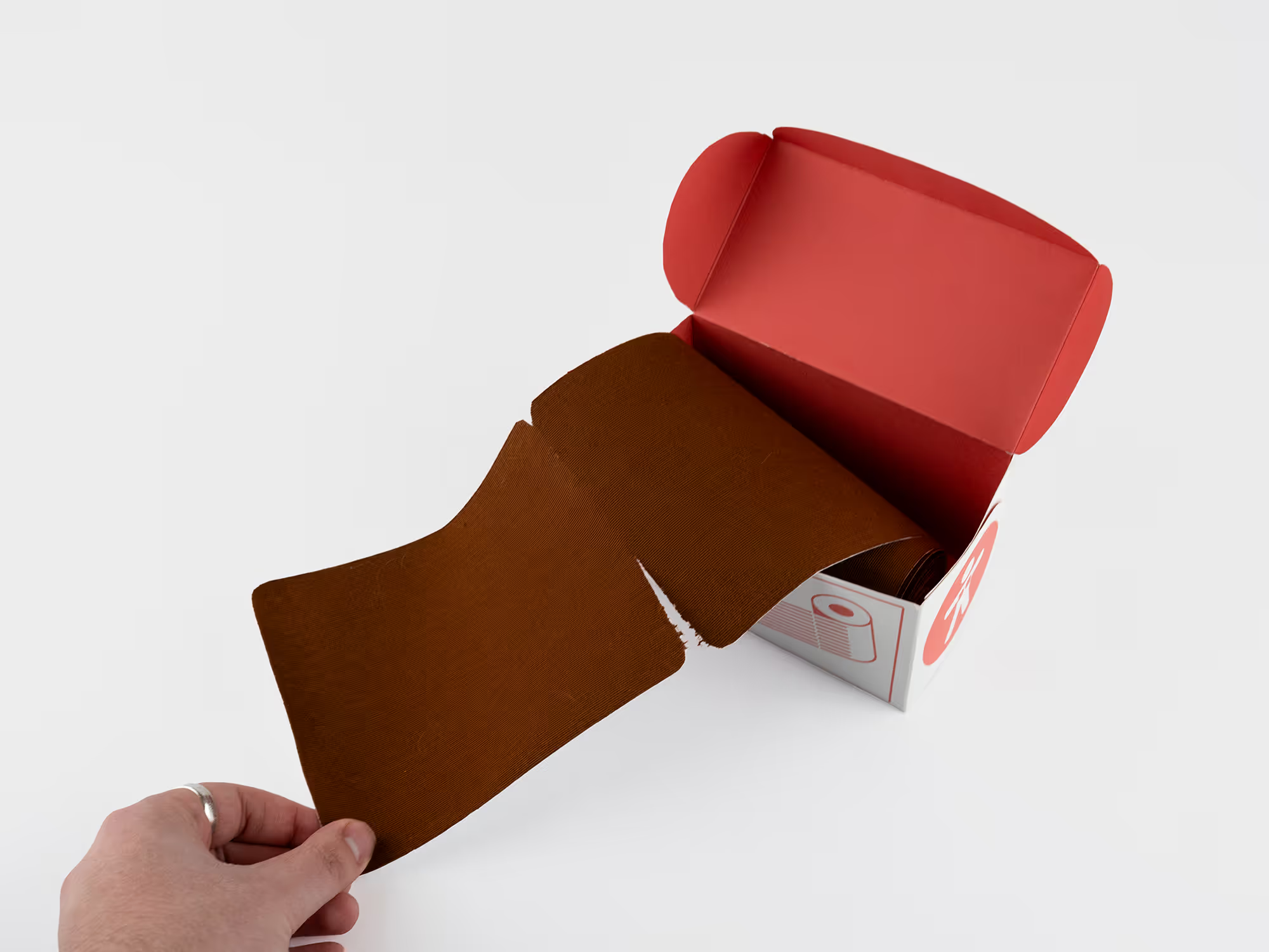
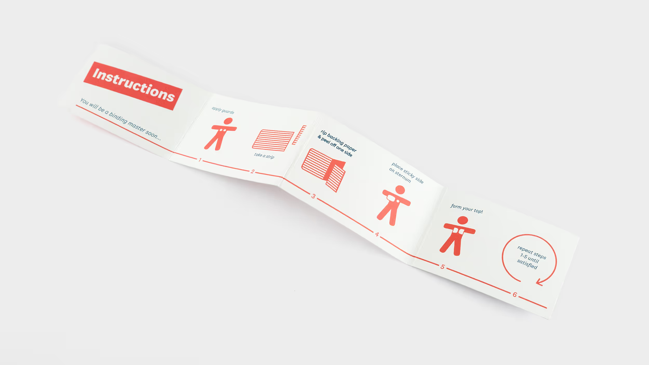
The box is designed like an aluminum foil box with tabs on both ends inside the box to hold the roll. Unlike the original TransTape®, I pre-cut the sheets, reoriented the box, and added the tabs, thus making the experience of using the product significantly easier and more pleasant for the customer.
^
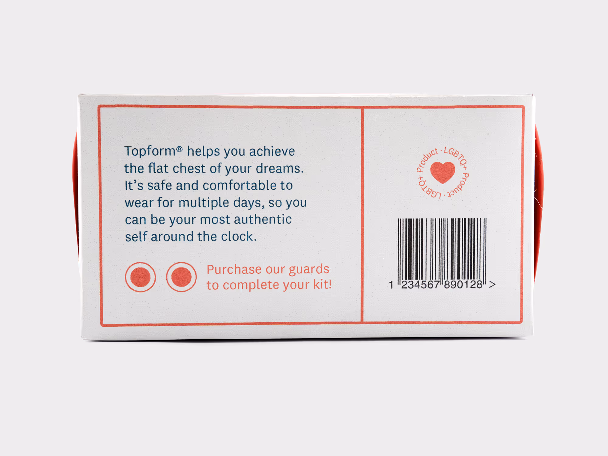
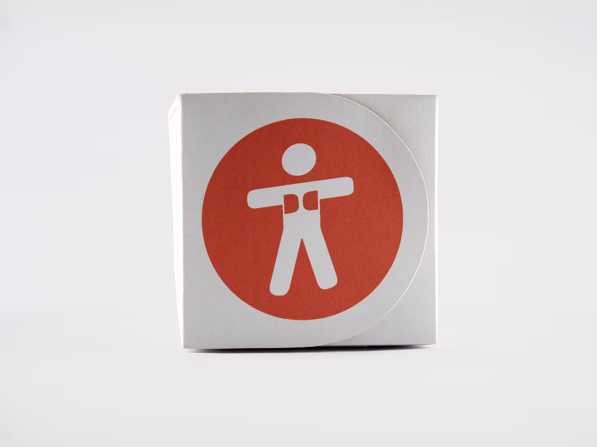
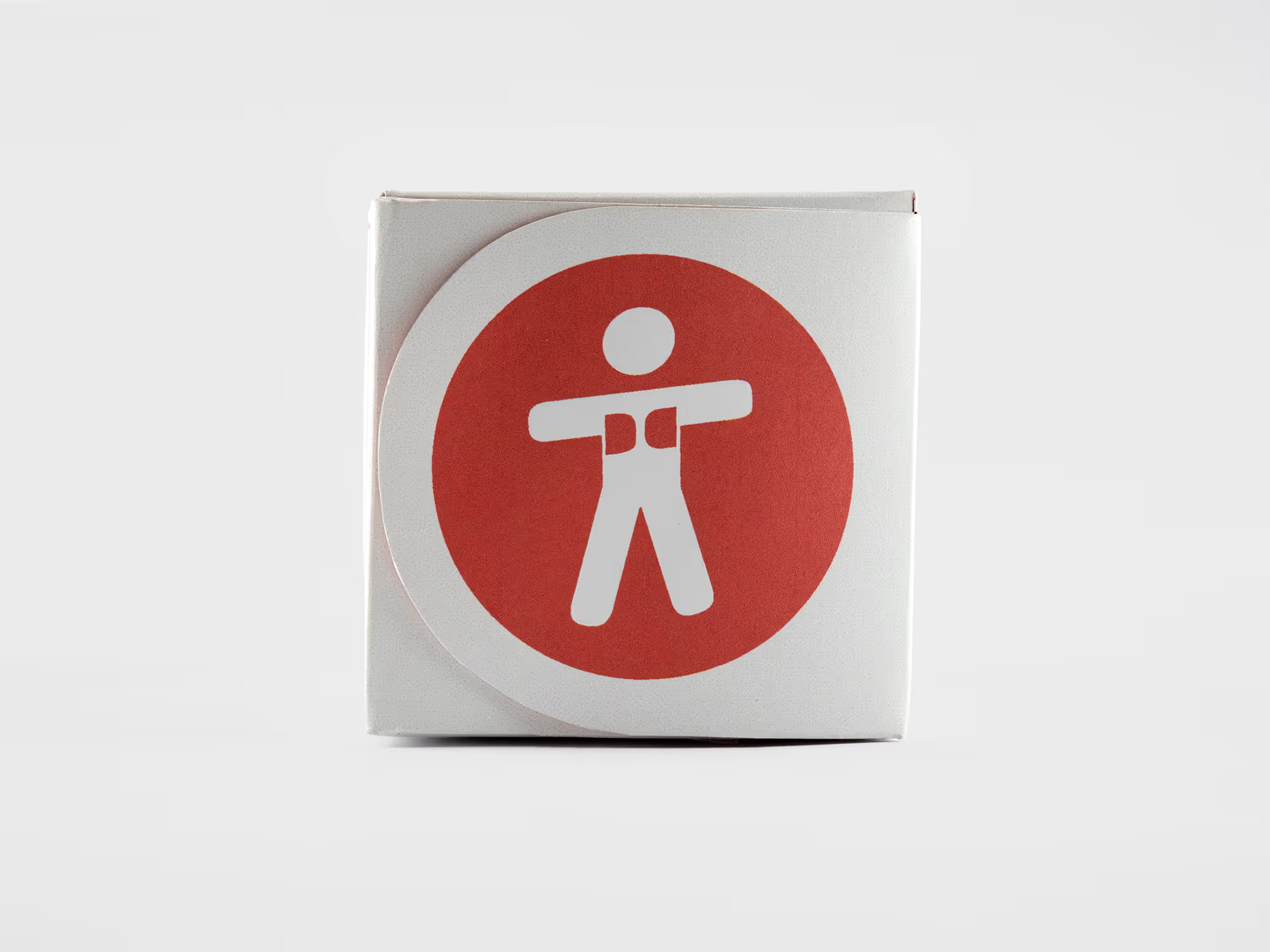
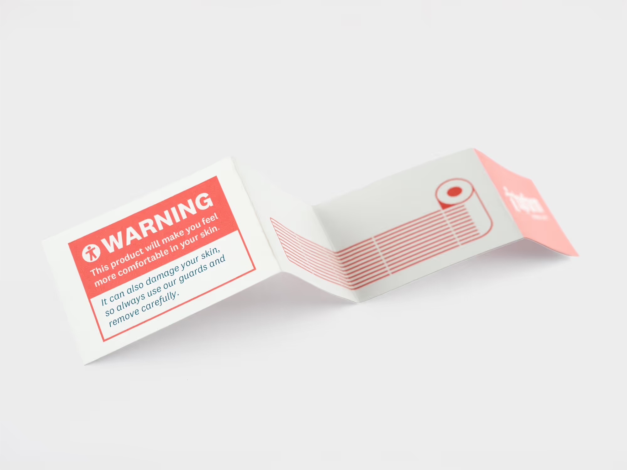
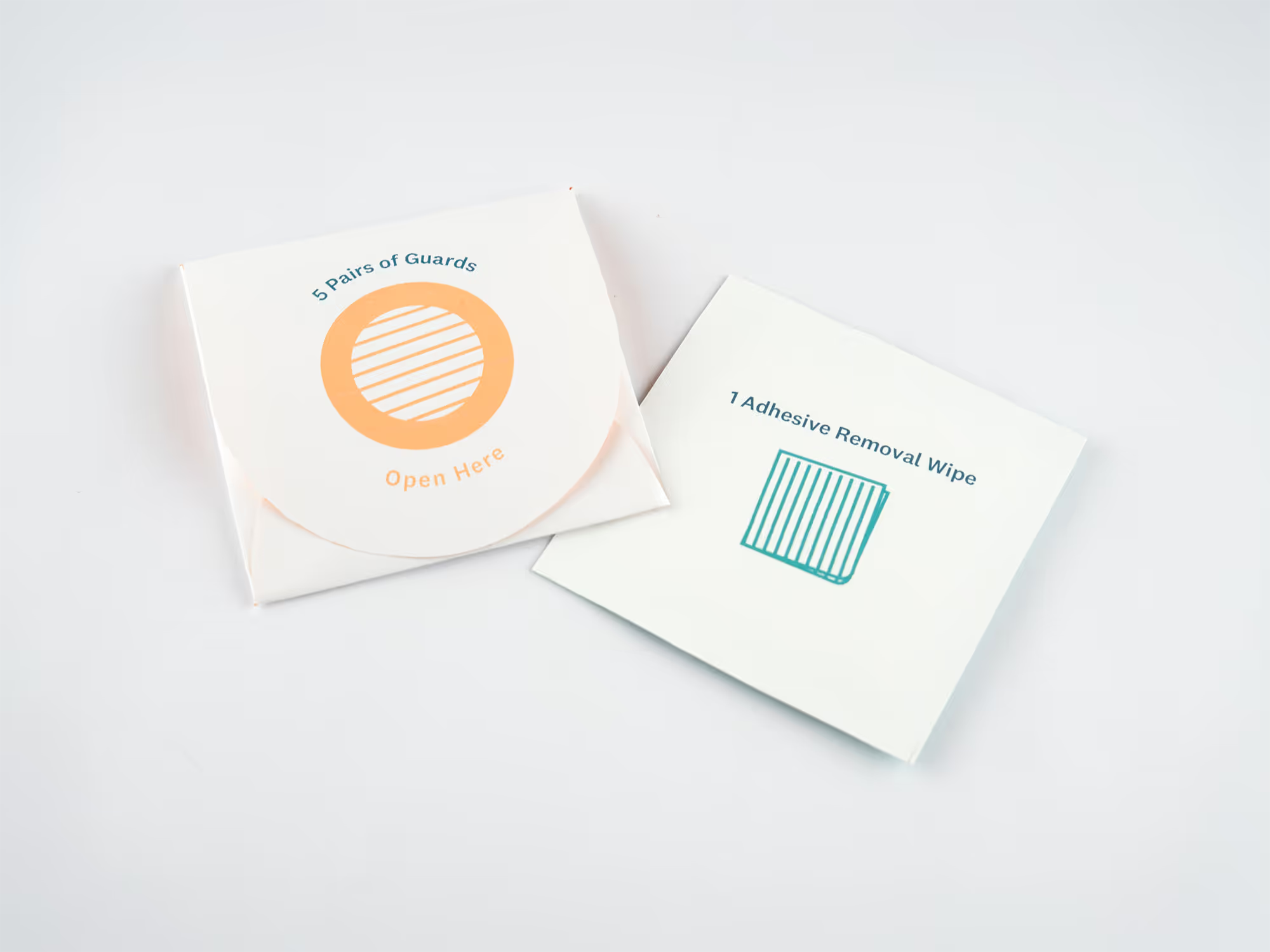
The guards and wipes are supplementary parts of the product lineup. These packages utilize high-quality light-weight paper to contain the smaller products.